Help us build this. Leave comments, suggest improvements, and help create better design documentation for agents.
Kopi Kenangan
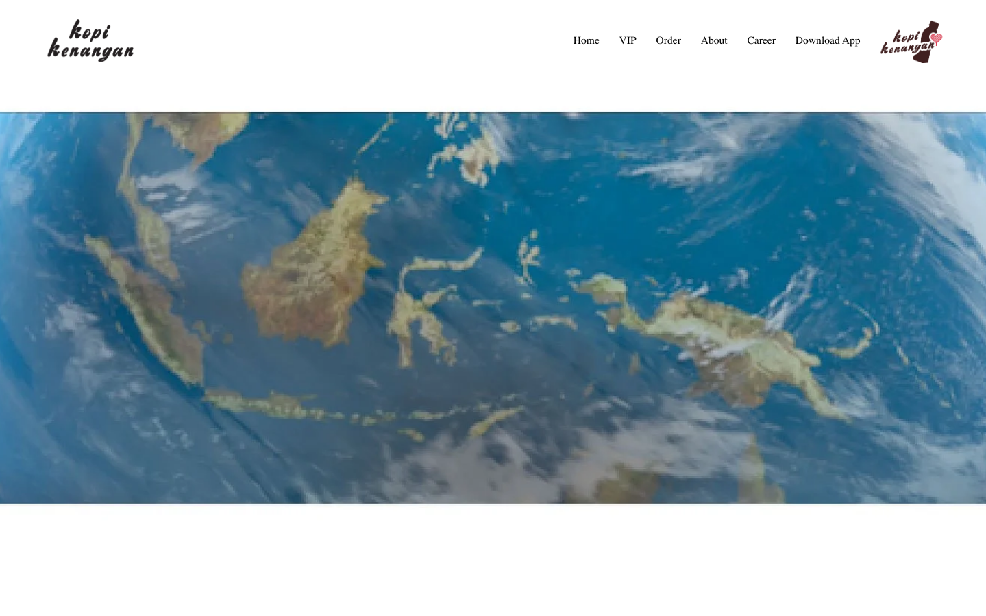
FoodKopi Kenangan creates an expansive, exploration-focused brand identity through dramatic aerial earth photography paired with clean, minimal navigation. The Figtree typography system balances approachable coffee culture with premium positioning, while the vast blue oceanic palette evokes discovery and wanderlust - perfect for a coffee brand that promises global experiences.
Design Identity
Signature Color
Ocean Discovery Blue
#4A90E2
Adventure and exploration - connecting Indonesian coffee culture to a world of possibilities
Visual Identity
Dramatic full-viewport aerial earth photography as hero backgrounds, creating an immersive sense of scale and global perspective that transforms coffee into a journey of discovery.
Component Style
Minimal floating navigation with subtle typography hierarchy. Components feel weightless against the expansive background - clean sans-serif links with medium weight (500) that don't compete with the dramatic imagery. Rounded corners at 5-6px create approachability without being overly casual.
Spacing Philosophy
Generous whitespace philosophy that lets the hero imagery breathe. Navigation elements float with ample padding, while form components use modest 10-12px internal spacing to maintain intimacy against the vast backdrop.
Design Principles
- Border radius stays consistent at 5-6px for subtle friendliness
- Typography hierarchy uses Figtree at 15.6px for navigation/buttons with 500 weight
- Hero backgrounds always full-viewport for maximum immersion
- Navigation remains minimal to preserve focus on imagery
- Form elements use 10-12px horizontal padding for comfortable interaction
Target Audience
Urban millennials and Gen-Z coffee enthusiasts who view their daily coffee ritual as part of a larger lifestyle of exploration and cultural discovery.
Mood
Design descriptions are AI-generated based on visual analysis and may not fully reflect the brand's official design guidelines.
Design System
Typography Scale
| Element | Font | Size | Weight | Line Height |
|---|---|---|---|---|
| body | 12px | 400 | normal | |
| h1 | 32.4px | 700 | 39.2558px | |
| h2 | 32.4px | 700 | 39.2558px | |
| h3 | 21.6px | 700 | 27.1814px | |
| h4 | 14.4px | 700 | 18.5702px | |
| p | 22px | 400 | 35.2px | |
| a | 15.6px | 500 | 15.6px | |
| button | 15.6px | 500 | 20.28px | |
| nav | 15.6px | 500 | 15.6px | |
| header | 15.6px | 500 | 15.6px |
Color Palette
No colors extracted


