Help us build this. Leave comments, suggest improvements, and help create better design documentation for agents.
Krafton
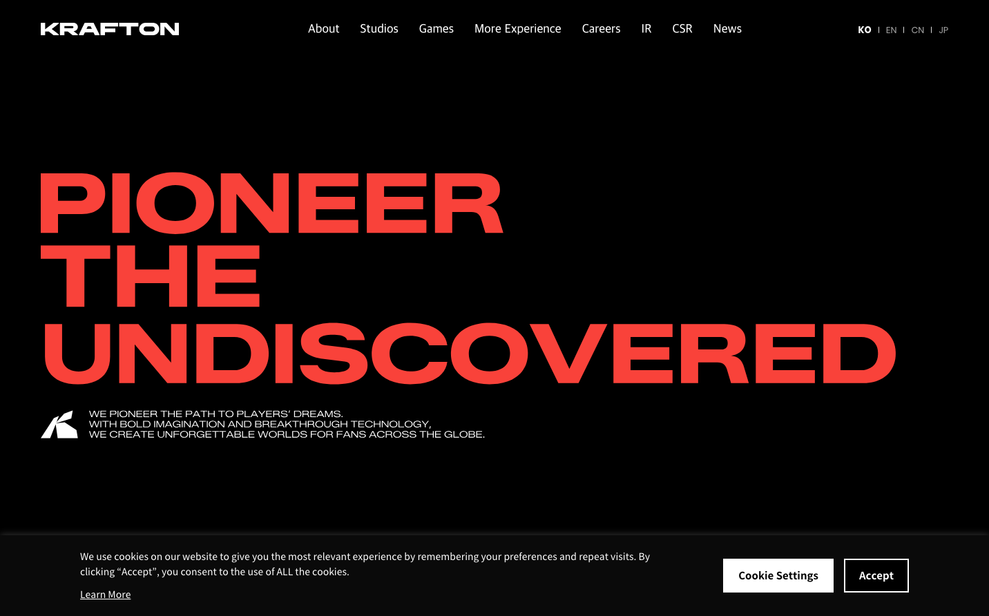
GamingKrafton's brand aesthetic is defined by theatrical boldness meeting precision engineering—massive red display typography dominates dark, minimal spaces like a battle cry for innovation. The ultra-wide letterforms create an industrial, almost architectural feeling that suggests both entertainment spectacle and technological mastery.
Design Identity
Signature Color
Krafton Battle Red
#FF4444
Aggressive innovation and gaming intensity—signals breakthrough disruption in the entertainment technology space
Visual Identity
Extreme typographic scale contrast—enormous red display text against vast black space with tiny supporting text, creating a cinematic poster-like hierarchy that's unmistakably gaming-focused
Component Style
Minimal, utilitarian components with sharp edges and no visual flourish—navigation feels like a precision instrument rather than decorative interface, emphasizing function over form
Spacing Philosophy
Dramatic breathing room with massive vertical gaps around hero typography, while header elements are tightly compressed—creates theatrical tension between overwhelming scale and precise control
Design Principles
- Typography scale jumps from 14px navigation to massive display sizes with no intermediate steps
- Red accent color used exclusively for primary messaging, never diluted across UI elements
- Black backgrounds dominate with pure white text for maximum contrast
- Noto Sans font stack maintains consistency across all international markets
- Zero decorative elements—every pixel serves functional purpose
Target Audience
Global gaming enthusiasts and industry professionals who value technical excellence over marketing polish—serious players who appreciate bold creative vision backed by engineering prowess
Mood
Design descriptions are AI-generated based on visual analysis and may not fully reflect the brand's official design guidelines.
Design System
Typography Scale
| Element | Font | Size | Weight | Line Height |
|---|---|---|---|---|
| body | 14px | 400 | 23.8px | |
| h1 | 14px | 400 | 0px | |
| h3 | 0px | 400 | 0px | |
| h4 | 24px | 400 | 31.2px | |
| h5 | 29px | 500 | 34.8px | |
| p | 16px | 400 | 22.4px | |
| a | 14px | 400 | 0px | |
| button | 24px | 700 | 24px | |
| input | 13.3333px | 400 | normal | |
| nav | 0px | 400 | 0px |
Color Palette
No colors extracted