Help us build this. Leave comments, suggest improvements, and help create better design documentation for agents.
Kueski
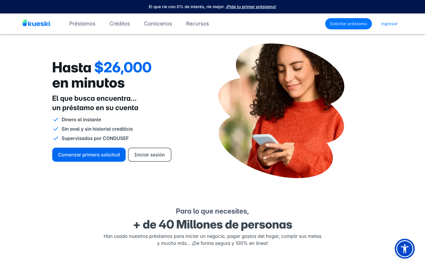
FintechKueski employs a friendly, approachable fintech aesthetic that balances professional credibility with human warmth. The brand uses bold electric blue as its signature, paired with conversational Spanish copy and a woman in vibrant orange, creating an inviting atmosphere that makes financial services feel accessible and trustworthy rather than intimidating.
Design Identity
Signature Color
Kueski Blue
#1E7EF7
accessible fintech trust - approachable yet professional financial services
Visual Identity
The combination of bold blue monetary values prominently displayed with warm, human photography featuring people in bright colors - creating a distinctive 'humanized fintech' aesthetic that's immediately recognizable.
Component Style
Rounded buttons with generous padding and soft corners (approximately 8px radius). The primary CTA uses bold blue with white text, while secondary buttons have outlined treatments. Components feel approachable and finger-friendly, avoiding sharp corporate edges in favor of welcoming, accessible forms.
Spacing Philosophy
Generous breathing room with large sections dedicated to hero messaging, balanced by comfortable padding within components. The layout prioritizes scannable hierarchy with ample whitespace around key CTAs and monetary values to draw focus.
Design Principles
- Corner radius consistently around 8px for buttons and components
- Typography uses Inter Variable with extreme weights - 800 for headlines, 400-600 for body
- Blue signature color reserved for primary actions and key financial figures
- Human photography always features people in warm colors (red, orange) to contrast cool blue
- Monetary values always prominently displayed in large, bold blue typography
Target Audience
Spanish-speaking individuals seeking accessible personal loans - people who may feel intimidated by traditional banking but need quick financial solutions
Mood
Design descriptions are AI-generated based on visual analysis and may not fully reflect the brand's official design guidelines.
Design System
Typography Scale
| Element | Font | Size | Weight | Line Height |
|---|---|---|---|---|
| body | 16px | 400 | 24px | |
| h1 | 48px | 800 | 52px | |
| h2 | 40px | 800 | 56px | |
| h3 | 32px | 700 | 22.4px | |
| h4 | 12px | 700 | 16.8px | |
| p | 14px | 600 | 24px | |
| a | 14px | 600 | 19.6px | |
| nav | 16px | 400 | 24px | |
| footer | 16px | 400 | 24px | |
| main | 16px | 400 | 24px |
Color Palette
No colors extracted


