Help us build this. Leave comments, suggest improvements, and help create better design documentation for agents.
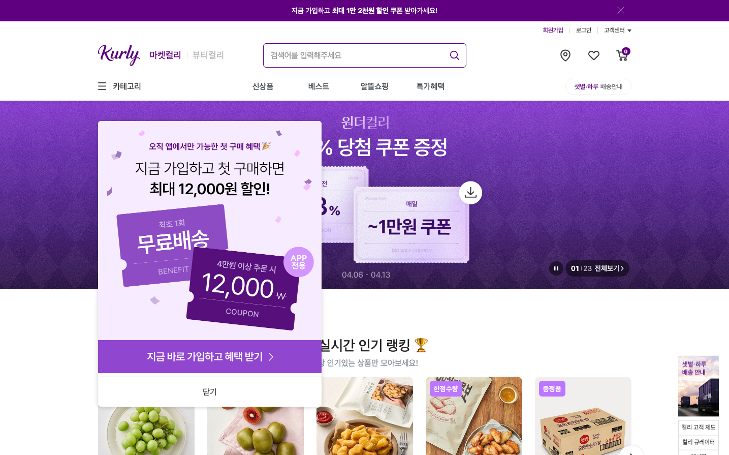
Kurly
E-commerceKurly employs a vibrant purple gradient-heavy aesthetic that feels both premium and playful, targeting Korean grocery shoppers with coupon-driven urgency. The design balances gamified promotional elements with clean e-commerce functionality, using bold Korean typography and layered card compositions.
Design Identity
Signature Color
Kurly Violet
#8B5CF6
premium grocery convenience with playful gamification
Visual Identity
Dramatic purple gradient backgrounds with floating coupon cards and Korean text overlays create an instantly recognizable promotional aesthetic that feels more like a mobile game than traditional e-commerce
Component Style
Rounded corner cards with subtle shadows layer over gradient backgrounds. Buttons have moderate 8-12px border radius with solid fills. White cards create strong contrast against purple, while maintaining soft, approachable edges throughout.
Spacing Philosophy
Dense promotional layouts with overlapping card elements create urgency, while generous padding within individual components maintains readability. Cards cluster tightly but have internal breathing room.
Design Principles
- Purple gradients dominate promotional sections
- Korean typography uses Pretendard at 14-16px base sizes
- Cards layer with 4-8px shadows for depth
- Border radius consistently 8-12px on interactive elements
- White space used strategically inside cards, not between them
Target Audience
Korean millennials and Gen-Z consumers who shop for groceries online and respond to gamified discount experiences
Mood
Design descriptions are AI-generated based on visual analysis and may not fully reflect the brand's official design guidelines.
Design System
Typography Scale
| Element | Font | Size | Weight | Line Height |
|---|---|---|---|---|
| body | 14px | 400 | 14px | |
| p | 16px | 400 | 24.64px | |
| a | 14px | 400 | 42px | |
| button | 14px | 400 | 14px | |
| input | 16px | 400 | 16px | |
| main | 14px | 400 | 14px |
Color Palette
#007aff