Help us build this. Leave comments, suggest improvements, and help create better design documentation for agents.
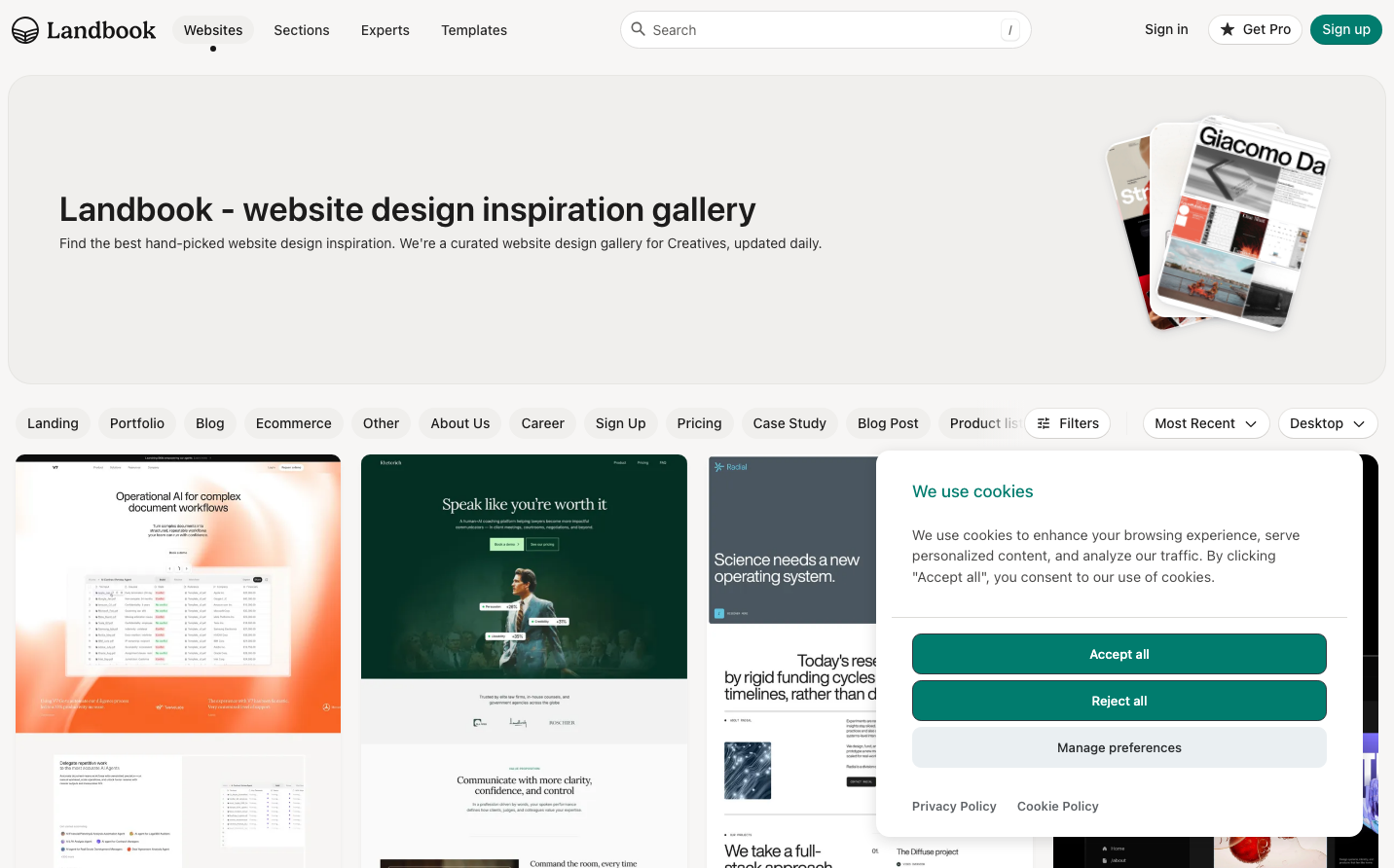
Land-book
DesignLandbook embodies a curator's precision with its gentle desert-sand color palette and architectural grid system. The brand feels like a sophisticated design studio - warm yet professional, with carefully organized website thumbnails that showcase digital craftsmanship like gallery pieces.
Design Identity
Signature Color
Curator Teal
#017c6e
Creative expertise and thoughtful curation - suggesting both digital sophistication and design authority
Visual Identity
Dense, perfectly-aligned grid of website thumbnails with consistent shadow treatment and precise spacing, creating a museum-like showcase of digital design specimens.
Component Style
Soft rounded corners (approximately 8px) with subtle drop shadows on cards, clean pill-shaped buttons with moderate padding. Everything feels approachable yet professional - like touching a well-crafted design tool.
Spacing Philosophy
Generous 32px gaps between content sections create breathing room, while tight 16px grid spacing keeps the gallery dense and scannable. The layout prioritizes content discovery over whitespace luxury.
Design Principles
- Typography exclusively uses Inter with weights 400, 500, and 600
- Primary teal (#017c6e) reserved only for interactive elements and CTAs
- Card shadows are consistent and subtle across all thumbnails
- Grid maintains exact alignment with no irregular spacing
- Background uses warm off-white (#f7f6f5) to reduce eye strain during browsing
Target Audience
Digital designers and creative professionals seeking curated website inspiration for client projects and personal portfolio development
Mood
Design descriptions are AI-generated based on visual analysis and may not fully reflect the brand's official design guidelines.
Design System
Typography Scale
| Element | Font | Size | Weight | Line Height |
|---|---|---|---|---|
| body | 14px | 400 | 21px | |
| h1 | 35px | 600 | 35px | |
| h2 | 17.5px | 500 | 20.125px | |
| h3 | 21px | 600 | 24.15px | |
| h4 | 23px | 600 | 26.45px | |
| h5 | 15.75px | 600 | 23.625px | |
| h6 | 14px | 600 | 16.1px | |
| p | 14px | 400 | 21px | |
| a | 17.5px | 400 | 26.25px | |
| button | 14px | 500 | 16.8px |
Color Palette
#2b2a2a#ffffff#f0efed#017c6e#017669#d63384#fcf8e3#f7f6f5#007aff#30363c#2c2f31#5e6266