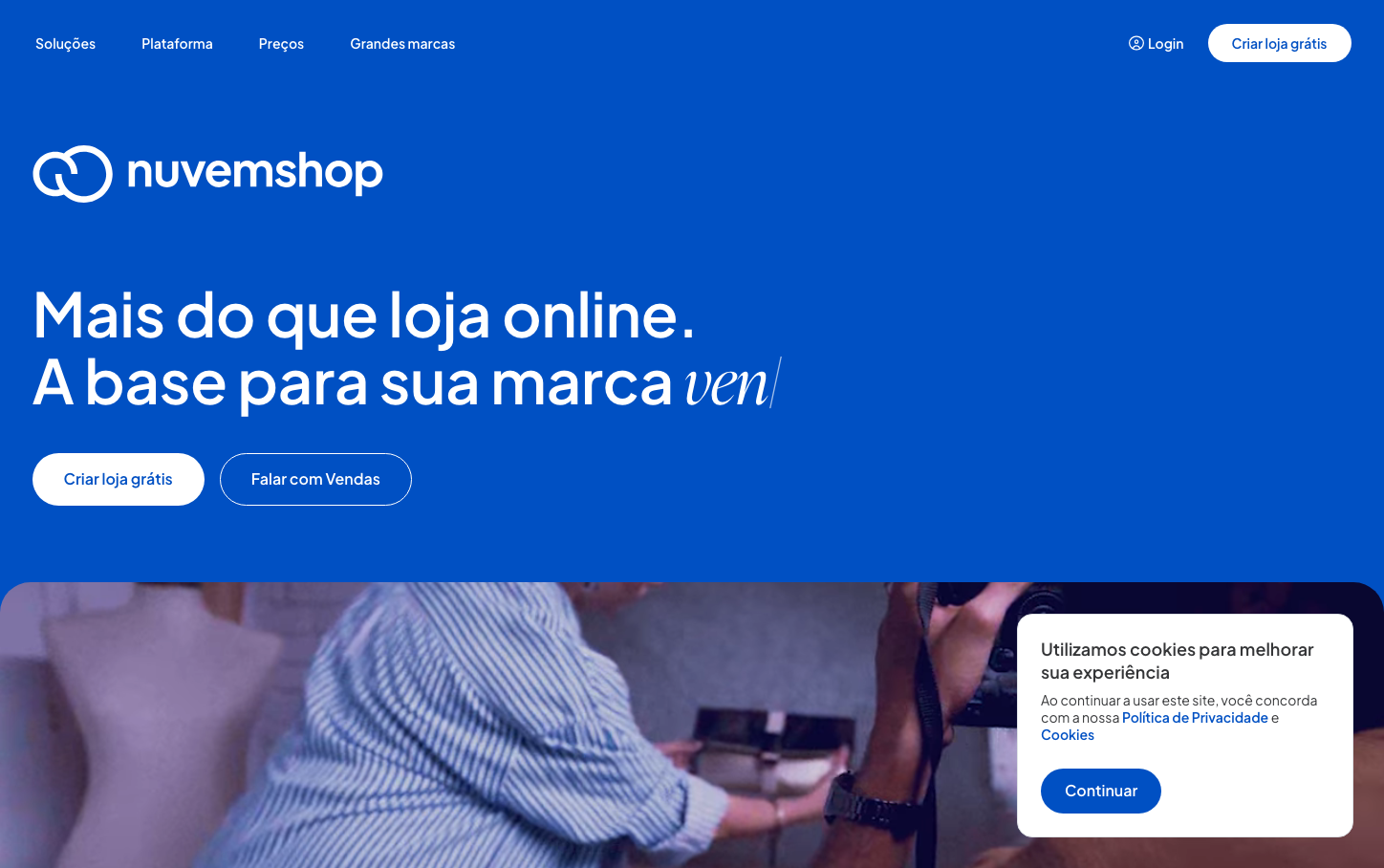
Help us build this. Leave comments, suggest improvements, and help create better design documentation for agents.
Lenskart
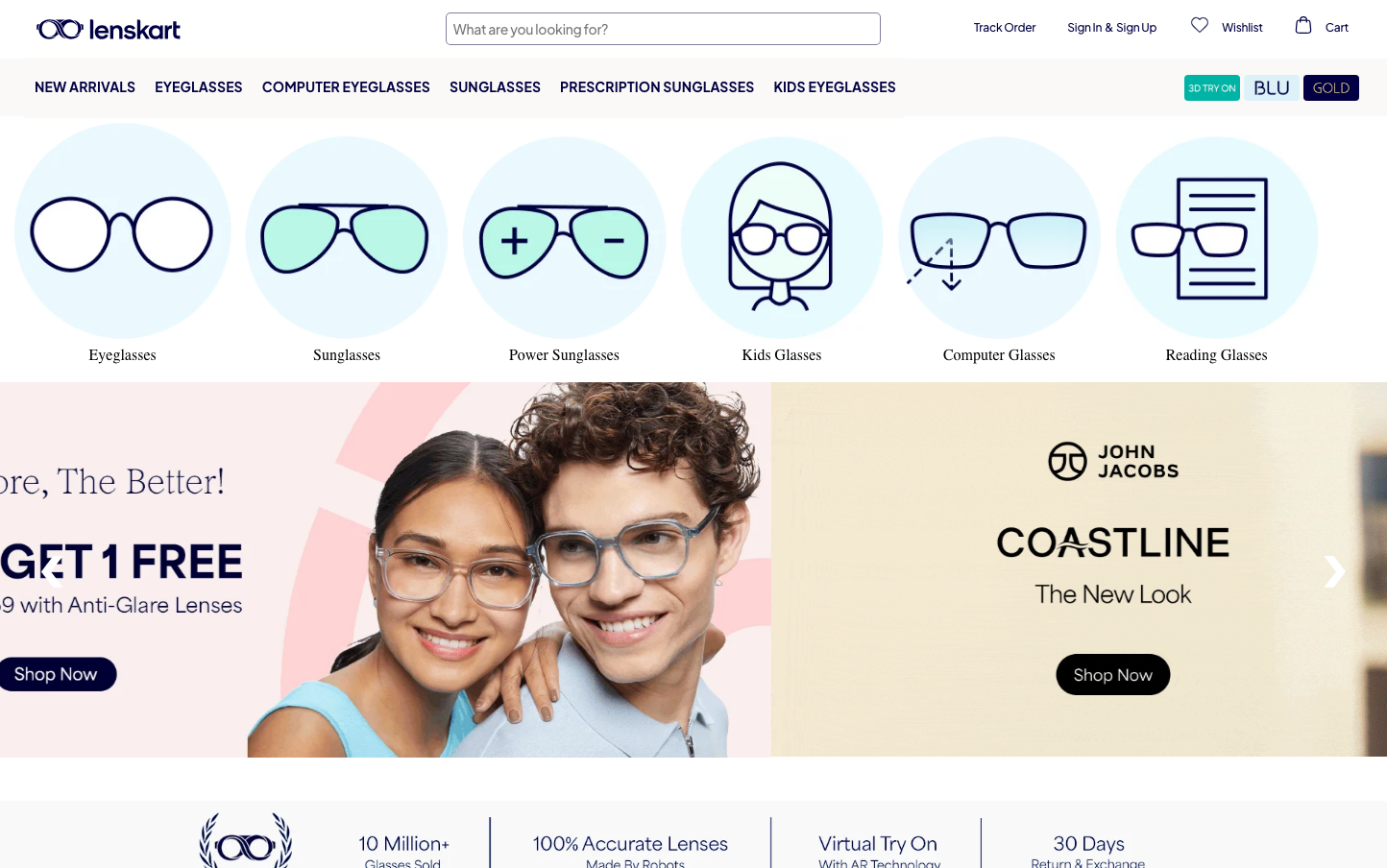
E-commerceLenskart embraces an approachable healthcare aesthetic with soft, rounded iconography and gentle visual hierarchy. The design balances medical precision with consumer friendliness through minimalist illustrations and subtle color accents that make eyewear shopping feel welcoming rather than clinical.
Design Identity
Signature Color
Lenskart Teal
#39C5BB
Healthcare trust meets modern accessibility - a calming yet confident color that bridges medical expertise with consumer comfort
Visual Identity
Distinctive circular icon system with outlined illustrations featuring gentle rounded corners and consistent stroke weights - creating a cohesive visual language that makes complex eyewear categories instantly recognizable
Component Style
Soft rounded corners (8-12px) with minimal shadows and clean borders. Buttons feel approachable with moderate padding, while cards use subtle elevation. Everything has a gentle, medical-grade cleanliness without being sterile
Spacing Philosophy
Generous 120px page margins create breathing room, while 20px grid spacing maintains comfortable density. The layout feels spacious enough for easy scanning of product categories without wasting valuable screen real estate
Design Principles
- Border radius consistently uses 8-12px for friendly approachability
- Typography relies on Plus Jakarta Sans at 13-30px for optimal readability
- Icons maintain consistent stroke weight with circular containers
- Color palette stays minimal with selective teal accents
- Page margins never go below 120px on desktop
Target Audience
Health-conscious millennials and Gen Z who value both style and functionality in their eyewear choices, seeking a digitally-native shopping experience that demystifies prescription glasses
Mood
Design descriptions are AI-generated based on visual analysis and may not fully reflect the brand's official design guidelines.
Design System
Typography Scale
| Element | Font | Size | Weight | Line Height |
|---|---|---|---|---|
| body | 13px | 400 | 18.5714px | |
| h1 | 26px | 700 | 37.1428px | |
| h2 | 30px | 700 | 42.8571px | |
| p | 13px | 400 | 18.5714px | |
| a | 16px | 600 | 22.8571px | |
| button | 13.3333px | 400 | normal | |
| input | 14px | 400 | 24px | |
| nav | 13px | 400 | 18.5714px | |
| header | 13px | 400 | 18.5714px | |
| footer | 13px | 400 | 18.5714px |
Color Palette
#000000#888888