Help us build this. Leave comments, suggest improvements, and help create better design documentation for agents.
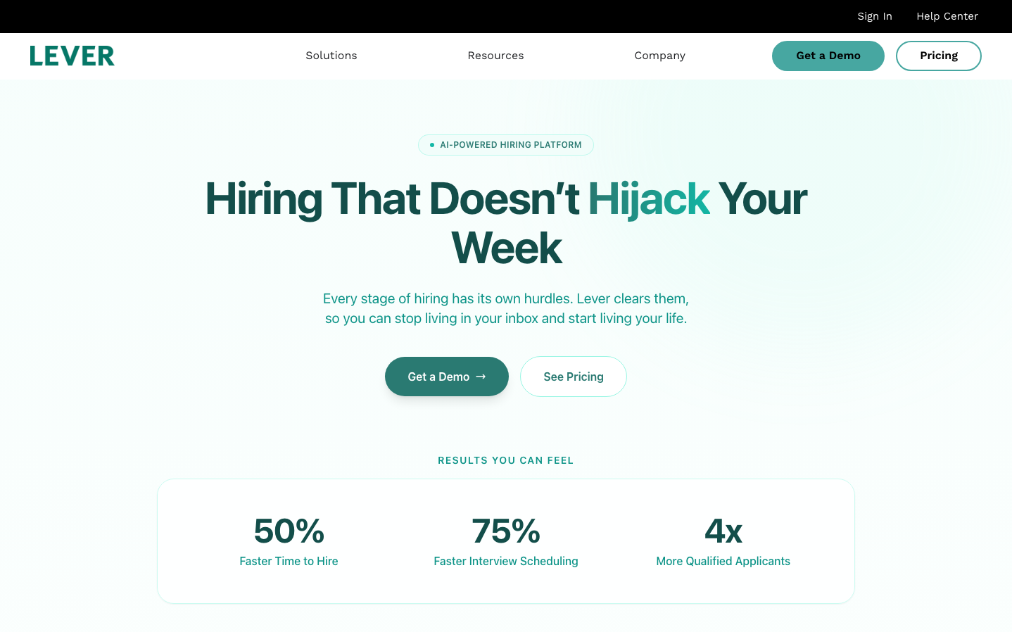
Lever
HR TechLever presents a sophisticated HR tech aesthetic that balances approachability with authority through its signature teal-green palette and generous whitespace. The typography system creates clear hierarchy with bold Onest headings that feel confident yet friendly, while Work Sans body text maintains professional readability.
Design Identity
Signature Color
Lever Teal
#4A9B8E
Professional growth and trustworthy automation - bridging the gap between human intuition and AI efficiency
Visual Identity
Abundant breathing room with centered content blocks, creating an almost editorial magazine feel that prioritizes message clarity over visual complexity.
Component Style
Softly rounded buttons (24px+ border radius) with substantial padding create approachable, finger-friendly interactions. No harsh shadows or borders - everything feels organic and inviting while maintaining digital precision.
Spacing Philosophy
Luxurious vertical spacing with 80-120px section gaps creates a premium, unhurried experience. Content is centered in generous white fields, making each section feel like a deliberate statement.
Design Principles
- Typography scale jumps dramatically: 64px headlines to 20px body text
- Border radius consistently generous at 24px+ for all interactive elements
- Color palette limited to teal accent, black text, and white backgrounds
- Center-aligned layouts with maximum 800px content width
- Minimum 80px vertical spacing between major sections
Target Audience
HR directors and talent acquisition managers at mid-to-large companies who value efficiency but need to maintain human connection in their hiring process
Mood
Design descriptions are AI-generated based on visual analysis and may not fully reflect the brand's official design guidelines.
Design System
Typography Scale
| Element | Font | Size | Weight | Line Height |
|---|---|---|---|---|
| body | 18px | 400 | 27px | |
| h1 | 64px | 700 | 70.4px | |
| h2 | 40px | 700 | 48px | |
| h3 | 36.8px | 700 | 47.84px | |
| p | 20px | 400 | 28px | |
| a | 18px | 400 | 27px | |
| button | 14px | 400 | 23.8px | |
| nav | 15px | 700 | 15px | |
| header | 18px | 400 | 27px | |
| footer | 18px | 400 | 27px |
Color Palette
#7a00df#007cba#006ba1#005a87#000000#abb8c3#ffffff#f78da7#cf2e2e#ff6900#fcb900#7bdcb5