Help us build this. Leave comments, suggest improvements, and help create better design documentation for agents.
LexisNexis
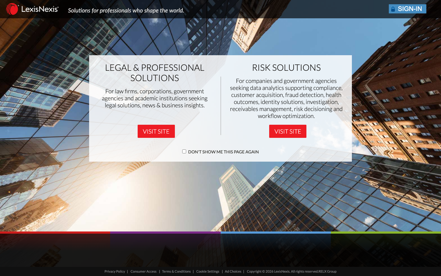
Legal TechLexisNexis presents a sophisticated legal-tech aesthetic with a dramatic architectural perspective that literally elevates the brand above street level. The ultra-light Lato typography creates an airy, intellectual atmosphere while the centered overlay design transforms corporate information into an elegant service menu floating against urban monumentality.
Design Identity
Signature Color
Legal Red
#E53E3E
Authoritative legal expertise with urgency and decisive action
Visual Identity
Dramatic upward-angled architectural photography with perfectly centered, semi-transparent overlay cards that create a floating information hierarchy against towering glass buildings
Component Style
Clean rectangular cards with subtle transparency, sharp corners, and bold red accent buttons. Components feel weightless and professional with generous internal padding and clear visual separation between sections.
Spacing Philosophy
Generous breathing room with wide margins around central content cards, creating a sense of premium focus. The overlay structure uses ample whitespace to separate distinct service offerings while maintaining visual unity.
Design Principles
- Typography uses exclusively 300 weight for elegant readability
- Red accent color only appears on primary action buttons
- Content is always center-aligned and overlay-based
- Architectural photography provides consistent backdrop
- Semi-transparent overlays maintain backdrop visibility
Target Audience
Senior legal professionals, corporate counsel, and government officials who need sophisticated data solutions and expect enterprise-grade presentation
Mood
Design descriptions are AI-generated based on visual analysis and may not fully reflect the brand's official design guidelines.
Design System
Typography Scale
| Element | Font | Size | Weight | Line Height |
|---|---|---|---|---|
| body | 16px | 300 | normal | |
| h1 | 32px | 300 | normal | |
| h2 | 28.8px | 300 | normal | |
| p | 19.2px | 300 | 23.04px | |
| a | 21px | 300 | normal | |
| input | 13.3333px | 400 | normal |
Color Palette
No colors extracted