Help us build this. Leave comments, suggest improvements, and help create better design documentation for agents.
Loewe
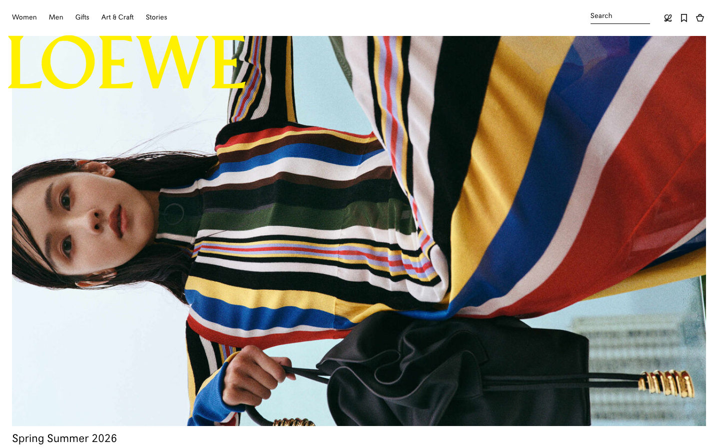
LuxuryLoewe embodies luxury fashion minimalism through stark contrast and editorial sophistication. The vibrant yellow wordmark against pristine white creates an arresting focal point, while the rainbow-striped fashion imagery suggests artistic expression within refined restraint.
Design Identity
Signature Color
Loewe Yellow
#f2ca56
luxury craft confidence - a bold statement color that commands attention while maintaining sophistication
Visual Identity
The oversized yellow LOEWE wordmark in a custom serif typeface positioned in the top-left corner - instantly recognizable even without context, creating a signature editorial fashion magazine aesthetic.
Component Style
Ultra-minimal interface with invisible buttons and seamless interactions. No visible borders, shadows, or traditional UI elements - everything dissolves into pure editorial content with typography doing all the heavy lifting.
Spacing Philosophy
Magazine-inspired layouts with generous negative space and asymmetrical composition. Large hero imagery dominates with minimal text elements precisely positioned for maximum editorial impact.
Design Principles
- Typography hierarchy uses only 2-3 sizes with custom Loewe serif for headlines
- Zero visible UI chrome - navigation and interactions are typographically integrated
- Color palette limited to black, white, and signature yellow for text elements
- All imagery fills maximum available space with minimal padding
- Text overlays use absolute positioning rather than contained layouts
Target Audience
Luxury fashion connoisseurs and art collectors who appreciate understated sophistication and editorial craftsmanship over flashy digital experiences
Mood
Design descriptions are AI-generated based on visual analysis and may not fully reflect the brand's official design guidelines.
Design System
Typography Scale
| Element | Font | Size | Weight | Line Height |
|---|---|---|---|---|
| body | 14px | 400 | normal | |
| h1 | 28px | 700 | normal | |
| h2 | 42px | 400 | 48.3px | |
| h3 | 12px | 400 | normal | |
| h4 | 18px | 400 | 22.5px | |
| p | 14px | 400 | 19.6px | |
| a | 14px | 400 | normal | |
| button | 14px | 400 | 0px | |
| input | 16px | 400 | 20px | |
| nav | 14px | 400 | normal |
Color Palette
#000000#f8f8f8#ffffff#f2ca56#d87d41#ae3433#56923b