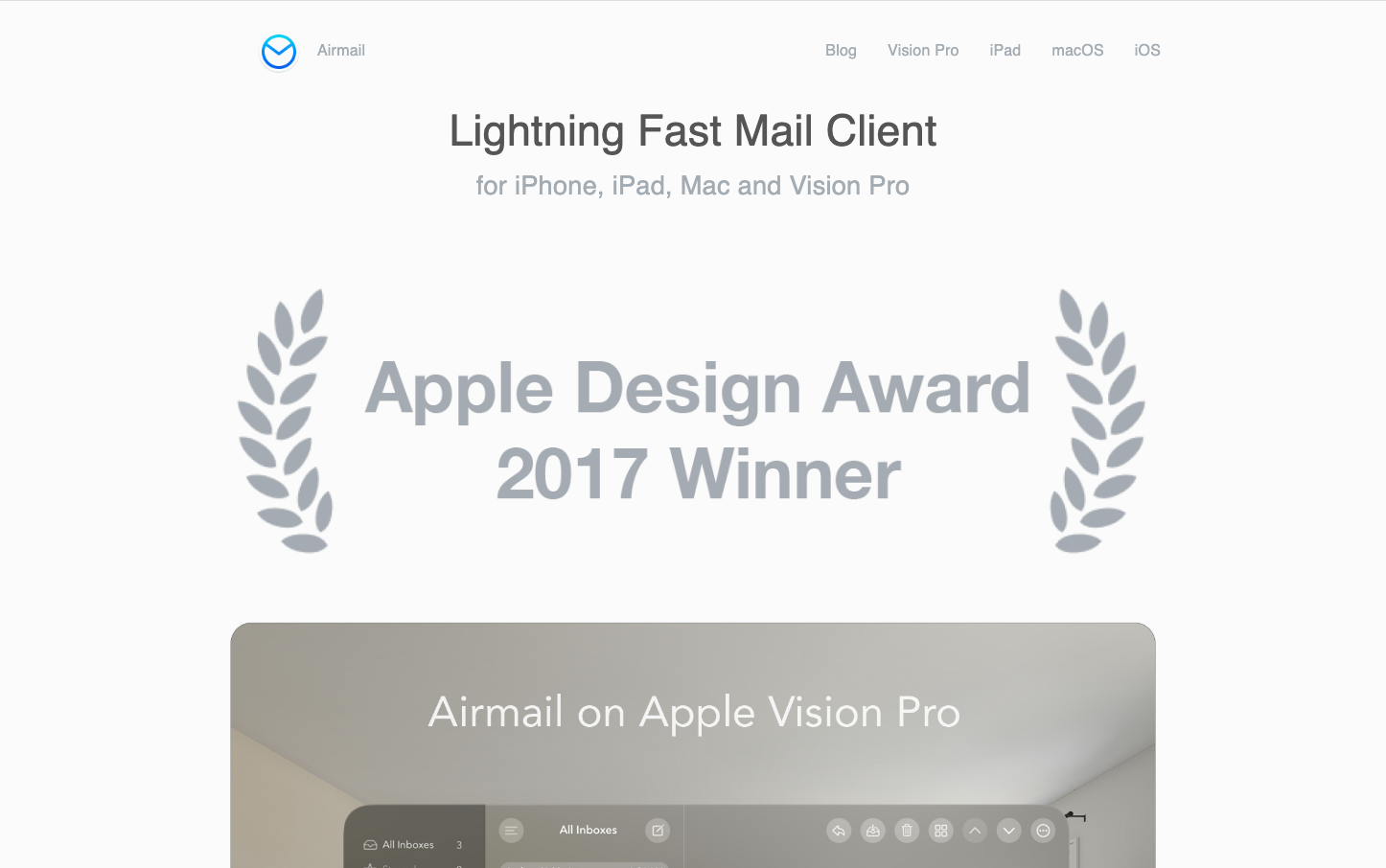
Help us build this. Leave comments, suggest improvements, and help create better design documentation for agents.
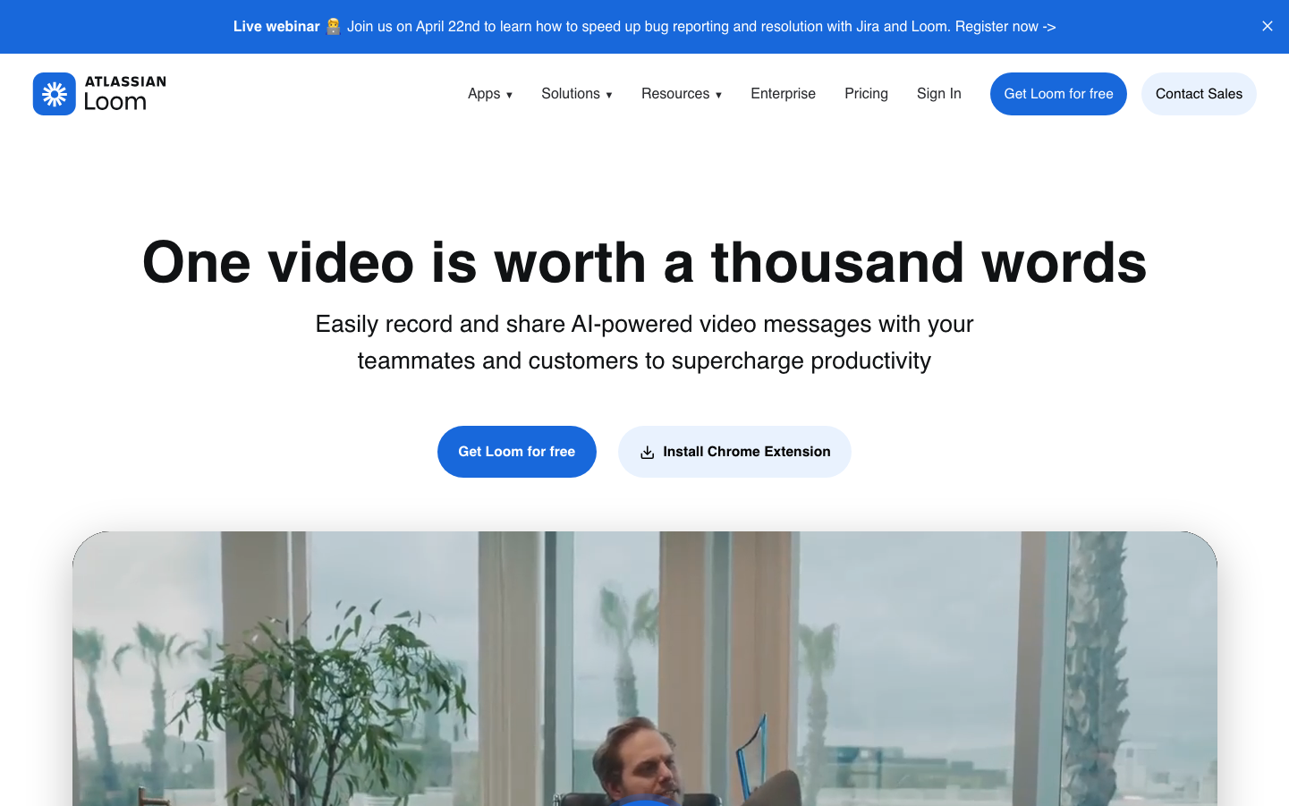
Loom
CommunicationLoom's brand radiates approachable professionalism through its distinctive Charlie typeface system and hero-focused blue palette. The design emphasizes human connection and accessibility, positioning video communication as natural and effortless rather than technical or intimidating.
Design Identity
Signature Color
Loom Blue
#1868db
Trustworthy accessibility - making professional video communication feel approachable and reliable
Visual Identity
The generous use of white space combined with the distinctive Charlie Display typeface creates an editorial magazine-like hierarchy that feels more human and conversational than typical SaaS products.
Component Style
Soft, pill-shaped buttons with generous padding and subtle shadows create an approachable, touchable feeling. Components favor rounded corners around 8-12px with gentle elevation rather than flat interfaces.
Spacing Philosophy
Expansive breathing room with large 80-120px section gaps creates a sense of calm confidence, while internal component spacing remains tight and purposeful to maintain focus on key actions.
Design Principles
- Headlines use Charlie Display at bold weights for editorial authority
- Body text maintains 16px base size for accessibility
- Blue accent color (#1868db) is reserved for primary actions only
- Shadows are layered and soft rather than hard drops
- Button radius stays between 8-24px for friendly approachability
Target Audience
Business professionals and remote teams who want to communicate more effectively but find traditional video tools intimidating or overly complex
Mood
Design descriptions are AI-generated based on visual analysis and may not fully reflect the brand's official design guidelines.
Design System
Typography Scale
| Element | Font | Size | Weight | Line Height |
|---|---|---|---|---|
| body | 16px | 400 | 24px | |
| h1 | 63.3113px | 700 | 65.1473px | |
| h2 | 44.1779px | 700 | 50.4953px | |
| h3 | 32.5156px | 700 | 41.3924px | |
| h4 | 12.6178px | 700 | 18.3589px | |
| p | 16px | 400 | 24px | |
| a | 15px | 400 | 22.5px | |
| button | 16px | 400 | 24px | |
| nav | 16px | 400 | 24px | |
| header | 16px | 400 | 24px |
Color Palette
#357de8#f8f8f8#f0f1f2#dddee1#b7b9be#8c8f97#7d818a#6c6f77#505258#3b3d42#292a2e#e4e2e7