Help us build this. Leave comments, suggest improvements, and help create better design documentation for agents.
Lunar
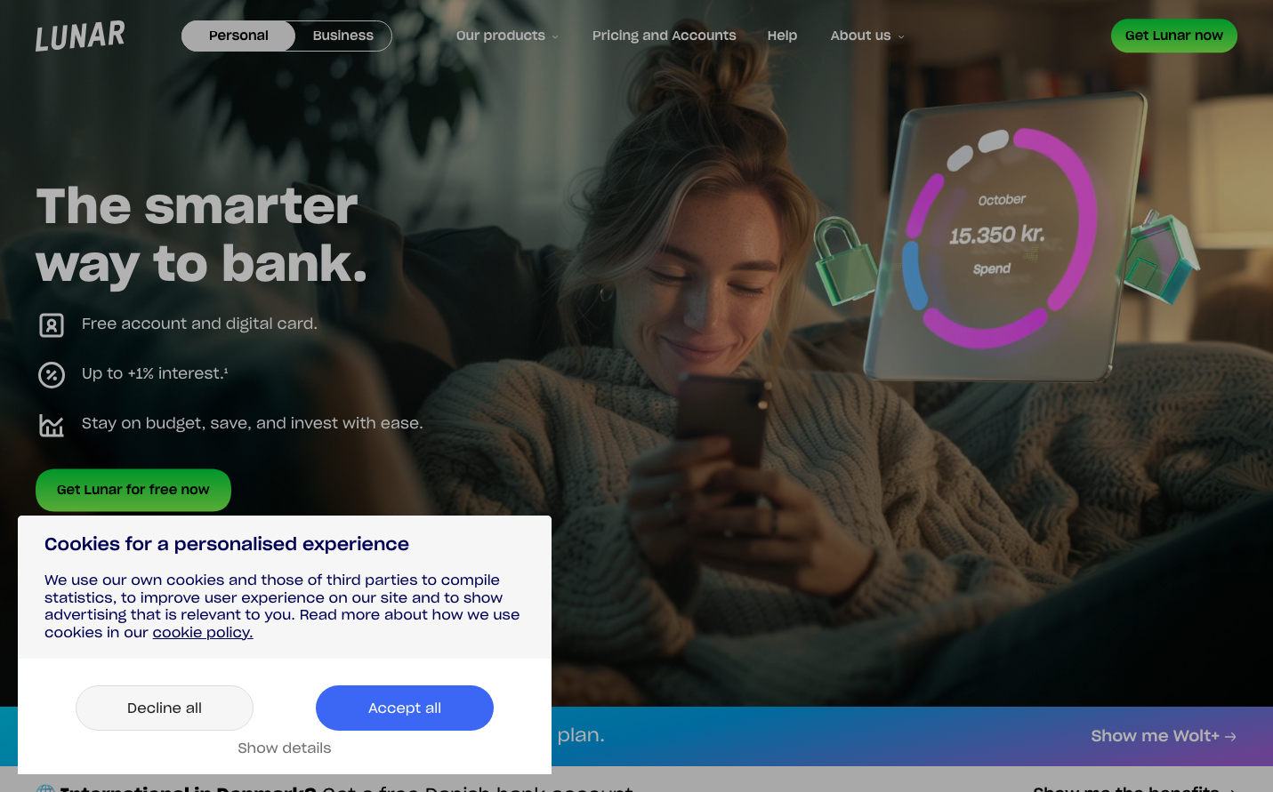
NeobankLunar presents a sophisticated nocturnal fintech aesthetic that balances intimacy with technological precision. The brand uses warm, cozy photography contrasted with vibrant neon data visualizations to suggest that advanced banking can feel personal and approachable, while maintaining an undertone of premium digital sophistication.
Design Identity
Signature Color
Lunar Mint
#00D084
Growth-focused fintech innovation - suggests both financial prosperity and fresh digital banking experience
Visual Identity
Floating holographic UI elements overlaying intimate, lived-in photography - creating a distinctive augmented reality aesthetic that makes digital banking feel tangible and human
Component Style
Soft pill-shaped buttons with generous rounded corners (24px+) and no harsh borders. Components feel cushioned and approachable with subtle transparency effects and gentle shadows that suggest they're floating above the surface.
Spacing Philosophy
Asymmetrical breathing room with large left-aligned text blocks balanced against floating right-side visualizations. Creates intimate conversation-like pacing rather than rigid grid structure.
Design Principles
- Primary buttons use 24px+ border radius for approachable pill shape
- Typography never exceeds 54px for headlines to maintain conversational tone
- UI overlays maintain transparency to preserve human connection
- Green accent color reserved exclusively for primary actions and positive data
- Photography always shows real living spaces, never sterile environments
Target Audience
Design-conscious millennials and Gen Z who want sophisticated financial tools but reject traditional banking's cold corporate aesthetic
Mood
Design descriptions are AI-generated based on visual analysis and may not fully reflect the brand's official design guidelines.
Design System
Typography Scale
| Element | Font | Size | Weight | Line Height |
|---|---|---|---|---|
| body | 16px | 400 | 25.6px | |
| h1 | 54px | 600 | 64.8px | |
| h2 | 19.5px | 500 | 23.4px | |
| h3 | 14px | 600 | normal | |
| p | 12.8px | 400 | normal | |
| a | 15px | 400 | normal | |
| button | 15px | 400 | normal | |
| input | 15px | 400 | normal | |
| nav | 16px | 400 | 25.6px | |
| header | 16px | 400 | 25.6px |
Color Palette
No colors extracted