Help us build this. Leave comments, suggest improvements, and help create better design documentation for agents.
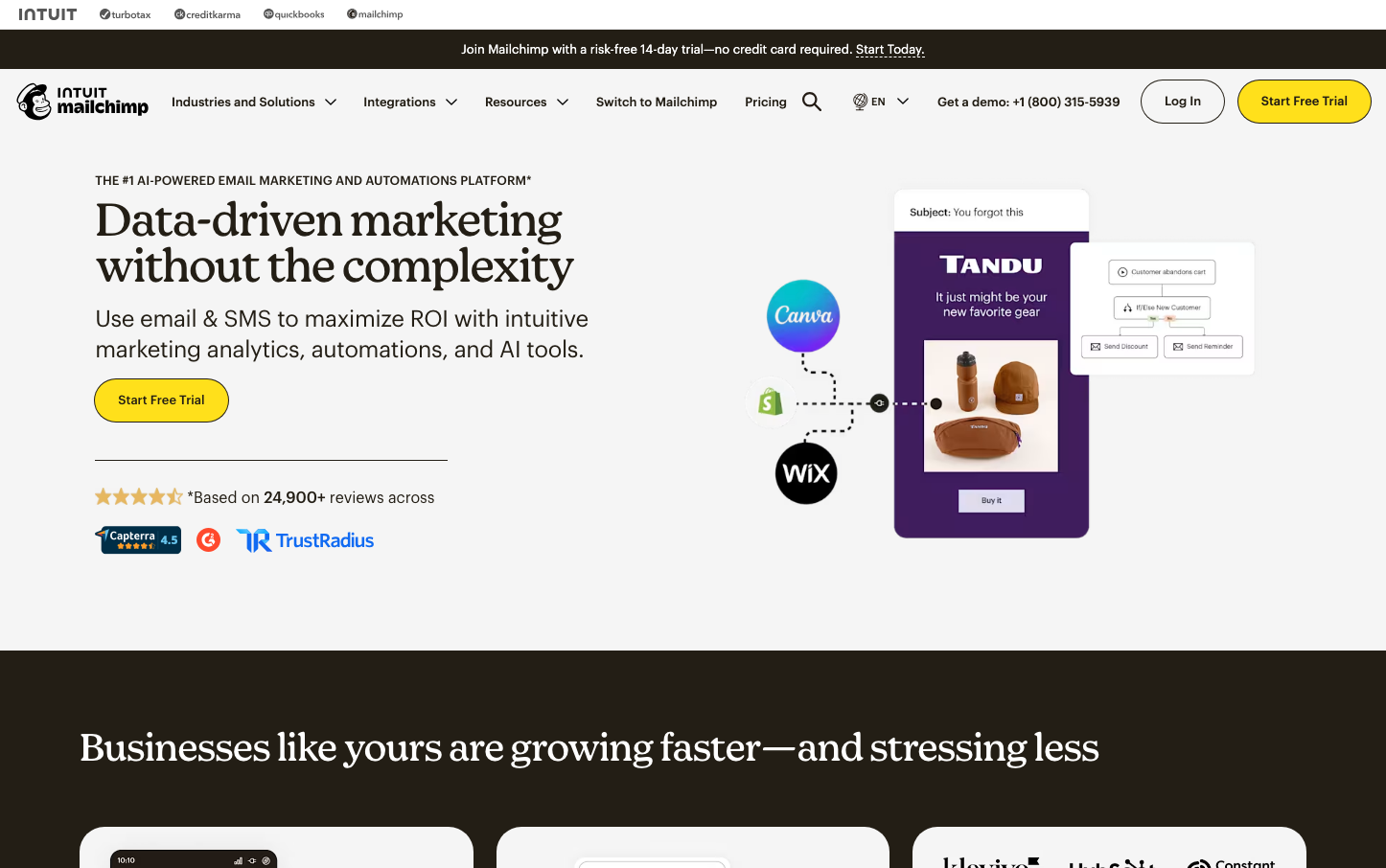
Mailchimp
MarketingMailchimp's identity radiates approachable professionalism through its signature banana-yellow punctuated by sophisticated serif headlines. The Means Web serif typography creates editorial gravitas while maintaining warmth, suggesting expert marketing guidance delivered with personality and charm.
Design Identity
Signature Color
Mailchimp Yellow
#ffe01b
optimistic creativity and accessible expertise - making sophisticated marketing feel approachable and energizing
Visual Identity
The bold yellow CTAs against clean white backgrounds with serif headlines create an instantly recognizable editorial-meets-marketing aesthetic that balances professionalism with creative energy.
Component Style
Buttons appear rounded with generous padding and bold yellow fills, while cards use clean white backgrounds with subtle shadows. The overall feel is soft and approachable rather than sharp or technical.
Spacing Philosophy
Generous whitespace creates breathing room between sections, with ample padding around key elements. The layout feels airy and uncluttered, prioritizing readability over information density.
Design Principles
- Headlines always use Means Web serif at 48px for maximum editorial impact
- Yellow CTAs (#ffe01b) are the only bright color accent against neutral backgrounds
- Dark borders (#231e15) on buttons create definition without harsh contrast
- Body text stays at 16px Graphik Web for consistent readability
- Generous line heights (1.35x font size) ensure comfortable reading
Target Audience
Small business owners and marketing managers who want professional results but appreciate friendly, non-intimidating guidance over technical complexity
Mood
Design descriptions are AI-generated based on visual analysis and may not fully reflect the brand's official design guidelines.
Design System
Typography Scale
| Element | Font | Size | Weight | Line Height |
|---|---|---|---|---|
| body | 16px | 400 | 21.6px | |
| h1 | 48px | 400 | 48px | |
| h2 | 40px | 400 | 40px | |
| h3 | 24px | 400 | 31.9999px | |
| h4 | 11px | 500 | 13.75px | |
| p | 13px | 400 | 17.55px | |
| a | 13px | 500 | 19.5px | |
| button | 13px | 500 | 14.3px | |
| input | 16px | 400 | 18.4px | |
| nav | 16px | 400 | 21.6px |
Color Palette
#ffe01b#dbd9d2#231e15