Help us build this. Leave comments, suggest improvements, and help create better design documentation for agents.
Mambu
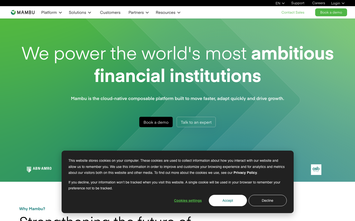
FintechMambu projects financial innovation through an optimistic emerald-to-teal gradient that feels energetic yet trustworthy. The Eina typography strikes a balance between approachable friendliness and corporate authority, while the expansive green gradient hero creates an atmosphere of growth and possibility.
Design Identity
Signature Color
Mambu Growth Green
#4fb645
Financial empowerment and sustainable growth - signals progress without the intimidation of traditional banking blue
Visual Identity
The sweeping diagonal gradient from vibrant green to deep teal creates an unmistakable sense of upward momentum and transformation, making any interface immediately recognizable as forward-thinking fintech.
Component Style
Clean, contemporary buttons with gentle rounded corners and subtle shadows. The primary CTA uses high-contrast black on the green gradient, while secondary actions maintain transparency with white text. Everything feels substantial but not heavy - purposeful without being aggressive.
Spacing Philosophy
Generous breathing room with hero content centered in vast green space, creating a sense of confidence and premium positioning. Navigation stays compact at the top while the main message gets expansive treatment below.
Design Principles
- Gradient backgrounds create energy while maintaining professionalism
- Typography mixing: Eina for headings/structure, Roboto for interaction elements
- Buttons use 6px border radius for modern but not overly playful feel
- Shadows are subtle and warm-toned, never harsh gray
- White text on dark backgrounds maintains high contrast accessibility
Target Audience
Progressive financial institutions and fintech leaders who want to signal innovation while maintaining enterprise credibility
Mood
Design descriptions are AI-generated based on visual analysis and may not fully reflect the brand's official design guidelines.
Design System
Typography Scale
| Element | Font | Size | Weight | Line Height |
|---|---|---|---|---|
| body | 16px | 400 | 24px | |
| h2 | 14px | 400 | 20px | |
| h4 | 32px | 400 | 48px | |
| p | 14px | 400 | 24.5px | |
| a | 14px | 400 | 24.5px | |
| button | 14px | 400 | 24.5px | |
| nav | 16px | 400 | 24px | |
| main | 16px | 400 | 24px |
Color Palette
#000000#4fb645#057472#ebeff0#212121#ffffff#08525b#7878ff


