Help us build this. Leave comments, suggest improvements, and help create better design documentation for agents.
Marshmallow
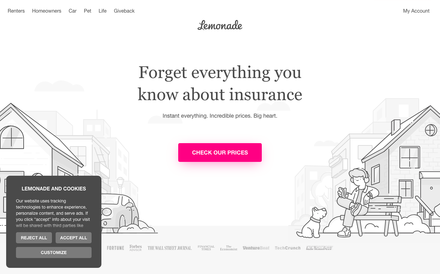
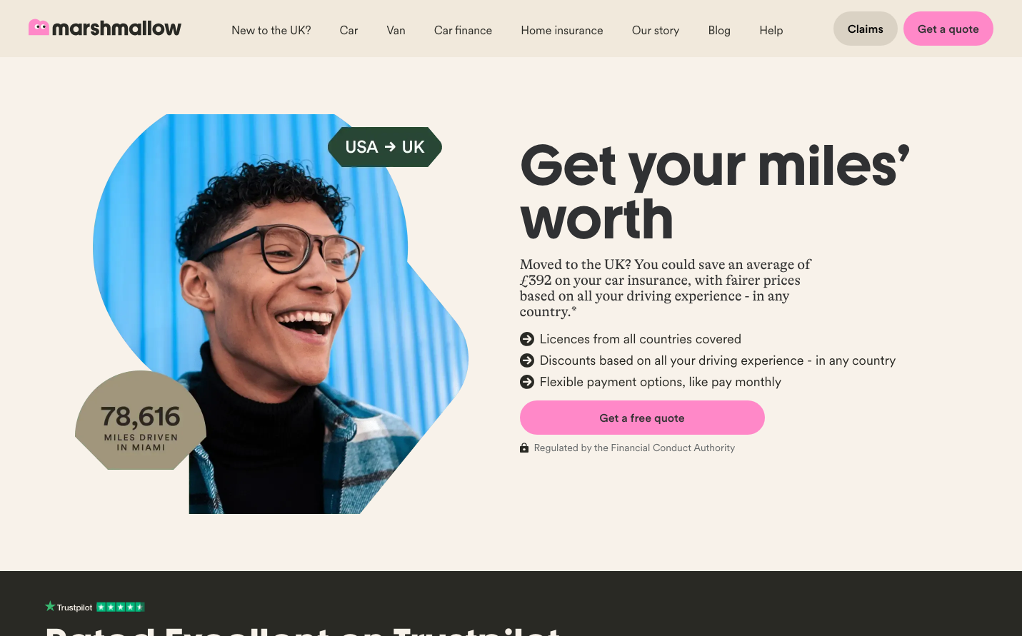
InsuranceMarshmallow embraces playful optimism through its vibrant coral-pink signature color and warm cream backgrounds that feel like a gentle embrace. The custom 'Marshmallowyouth' typeface for headlines creates an approachable, friendly personality while maintaining professional credibility through clean secondary fonts.
Design Identity
Signature Color
Marshmallow Pink
#FF69B4
approachable financial innovation - making insurance feel warm and human rather than cold and corporate
Visual Identity
The distinctive organic blob shapes and asymmetrical compositions create a fluid, friendly aesthetic that breaks away from traditional insurance industry rigidity - recognizable by its soft geometric forms and warm color palette.
Component Style
Generously rounded buttons with soft shadows and pill-shaped forms. Everything feels pillowy and touchable with approximately 24px+ border radius on primary elements, minimal borders, and gentle depth through subtle shadows rather than harsh lines.
Spacing Philosophy
Asymmetrical, organic spacing that feels natural rather than grid-locked. Large breathing room around hero elements with intimate clustering of related content - mimicking how people naturally arrange comfortable spaces.
Design Principles
- Headlines use custom Marshmallowyouth at 56px+ for personality
- Body text stays readable with Gt Alpina Standard at 20px
- Border radius never goes below 16px for softness
- Warm cream backgrounds (#f8f6f6-#f9f9f9) dominate over pure white
- Organic shapes break rectangular constraints
Target Audience
Young professionals and families seeking insurance who value transparency and human connection over corporate formality - people who want financial products that feel personal and trustworthy.
Mood
Design descriptions are AI-generated based on visual analysis and may not fully reflect the brand's official design guidelines.
Design System
Typography Scale
| Element | Font | Size | Weight | Line Height |
|---|---|---|---|---|
| body | 14px | 400 | 20px | |
| h1 | 80px | 700 | 75.2px | |
| h2 | 56px | 700 | 53.76px | |
| h3 | 56px | 700 | 53.76px | |
| h6 | 18px | 400 | 21.6px | |
| p | 20px | 400 | 22px | |
| a | 14px | 500 | 20px | |
| button | 14px | 400 | 20px | |
| nav | 14px | 400 | 20px | |
| header | 14px | 400 | 20px |
Color Palette
#f8f6f6#f4f4f4#f9f9f9