Help us build this. Leave comments, suggest improvements, and help create better design documentation for agents.
Maze
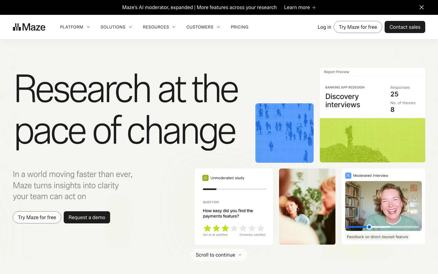
Design ResearchMaze embodies research velocity through an ultra-light typographic hierarchy anchored by the impossibly thin Phonic typeface at massive scales. The brand radiates analytical clarity with data-driven confidence, using generous whitespace and subtle gradients to create an atmosphere of premium research intelligence.
Design Identity
Signature Color
Maze Lime
#C5FF41
breakthrough insight energy - the moment when unclear data becomes actionable clarity
Visual Identity
Impossibly thin typography at heroic scales (130px headlines at 300 weight) combined with bright lime accent colors and data visualization snippets embedded naturally in the layout
Component Style
Exceptionally soft rounded corners with subtle gradients and minimal shadows. Buttons feel pillowy and approachable while maintaining research-grade precision. Cards have gentle elevation with data-focused layouts.
Spacing Philosophy
Expansive breathing room around hero typography with tight, data-dense clustering for research artifacts. Massive 80px+ gaps between sections create executive-level gravitas while research components maintain analytical density.
Design Principles
- Typography weight never exceeds 400 - everything stays whisper-light
- Hero headlines start at 90px minimum for maximum impact
- Lime green appears only as accent color, never as primary surface
- Research artifacts always shown in context, never isolated
- Border radius consistently generous (16px+) for approachability
Target Audience
Senior UX researchers and product leaders at scale-up companies who need to transform user insights into executive-level strategic decisions
Mood
Design descriptions are AI-generated based on visual analysis and may not fully reflect the brand's official design guidelines.
Design System
Typography Scale
| Element | Font | Size | Weight | Line Height |
|---|---|---|---|---|
| body | 16px | 400 | 24px | |
| h1 | 130px | 300 | 136.5px | |
| h2 | 90px | 300 | 90px | |
| h3 | 46px | 300 | 52.9px | |
| h4 | 28px | 300 | 36.4px | |
| p | 17px | 400 | 24.0006px | |
| a | 16px | 400 | 24px | |
| button | 17px | 400 | 17px | |
| input | 15px | 400 | 21px | |
| header | 16px | 400 | 24px |
Color Palette
#ffffff

