Help us build this. Leave comments, suggest improvements, and help create better design documentation for agents.
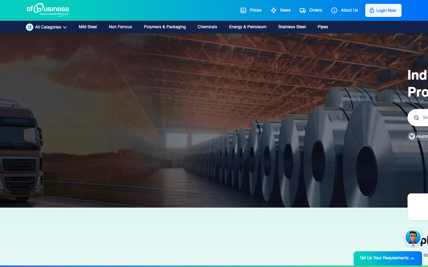
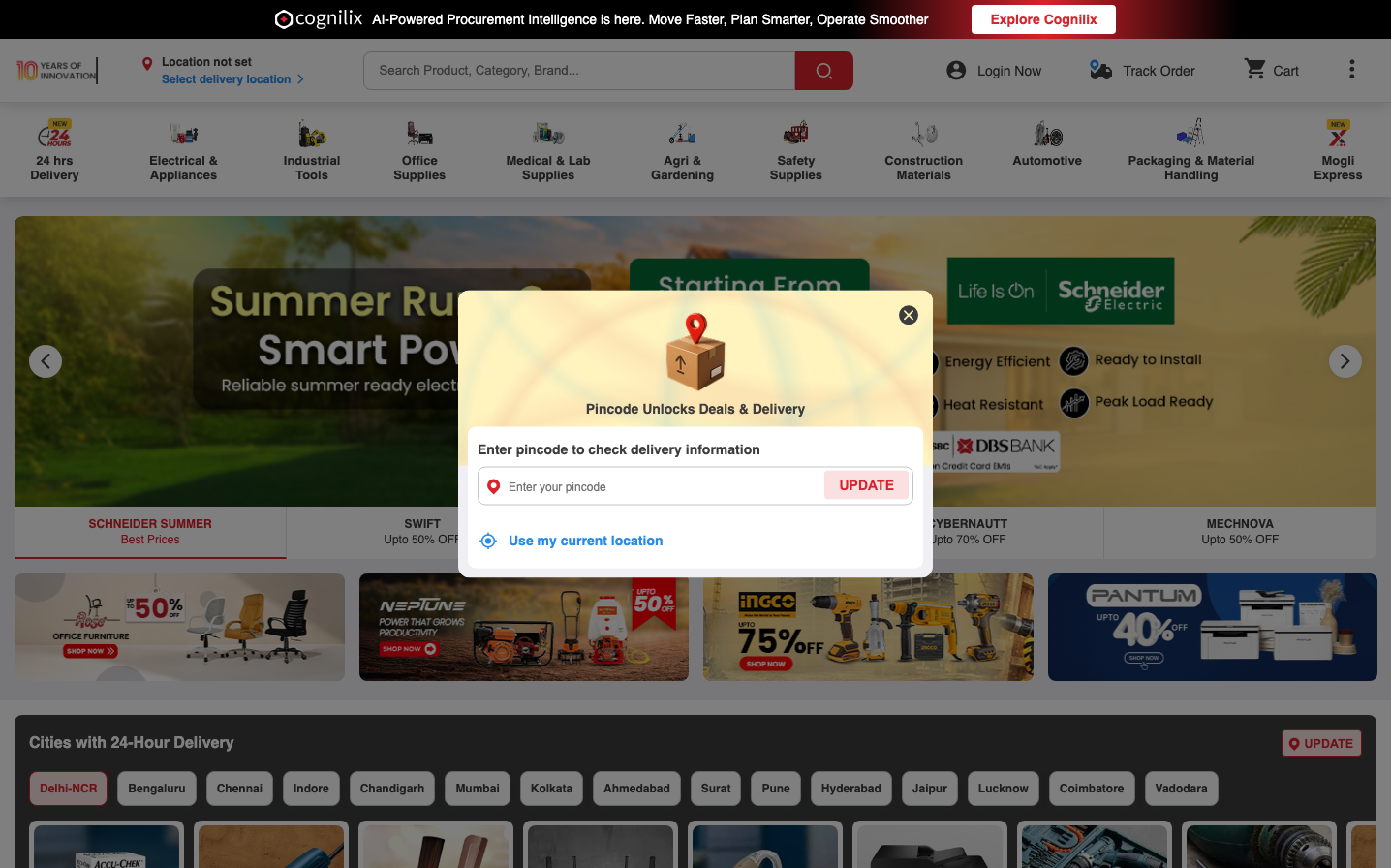
Moglix
B2BMoglix embodies industrial-strength B2B commerce with a dense, information-rich layout that prioritizes efficiency over aesthetics. The red-orange accent color against utilitarian grays creates an urgent, action-oriented atmosphere that speaks to procurement professionals who need to move fast and make decisions quickly.
Design Identity
Signature Color
Procurement Red
#C4434C
Urgency and decisive action in B2B procurement - cutting through complexity to drive business results
Visual Identity
Dense category grid layout with maximum information density - every pixel serves a functional purpose, creating a warehouse-like efficiency that industrial buyers recognize instantly
Component Style
Compact, rectangular elements with minimal border radius (2-4px max) and subtle box shadows. Buttons are purposeful and dense, forms are utilitarian, everything feels built for high-volume transactions rather than browsing pleasure
Spacing Philosophy
Tight, economical spacing that maximizes content density - 8-16px gaps between elements create a packed, inventory-like feel where every square inch has value
Design Principles
- Information density over visual comfort
- Border radius never exceeds 4px for industrial feel
- Roboto typography at compact 12-16px sizes for efficiency
- Red accent color used sparingly for critical CTAs only
- Category icons must be immediately recognizable
Target Audience
Industrial procurement managers and B2B buyers who prioritize functionality, speed, and comprehensive product access over aesthetic experience
Mood
Design descriptions are AI-generated based on visual analysis and may not fully reflect the brand's official design guidelines.
Design System
Typography Scale
| Element | Font | Size | Weight | Line Height |
|---|---|---|---|---|
| body | 12px | 400 | normal | |
| h1 | 16px | 600 | normal | |
| h2 | 18px | 700 | normal | |
| h3 | 16px | 600 | normal | |
| p | 14px | 500 | normal | |
| a | 14px | 600 | normal | |
| button | 14px | 600 | normal | |
| input | 13.3333px | 400 | normal | |
| header | 12px | 400 | normal |
Color Palette
#3c3c3c