Help us build this. Leave comments, suggest improvements, and help create better design documentation for agents.
Monday.com
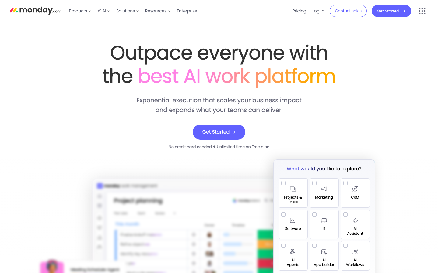
ProductivityMonday's brand radiates optimistic productivity energy through playful pink-to-orange gradient headlines that contrast against clean white space. The Poppins typography feels approachable yet professional, creating a sense of 'work made joyful' rather than corporate sterility.
Design Identity
Signature Color
Monday Blue
#6161FF
Energetic productivity and AI-powered confidence that makes work feel engaging rather than overwhelming
Visual Identity
The vibrant pink-to-orange gradient text treatment on key phrases like 'best AI work platform' - this colorful highlighting technique makes Monday instantly recognizable without needing a logo.
Component Style
Soft, approachable buttons with generous 24px+ border radius and subtle shadows. Everything feels pillowy and friendly rather than sharp - even the interface preview shows rounded cards with gentle depth, creating a 'productivity playground' aesthetic.
Spacing Philosophy
Luxuriously airy with massive 80px+ vertical gaps between sections. The hero area uses abundant whitespace to let the gradient text breathe, while the right-side interface preview maintains comfortable margins that never feel cramped.
Design Principles
- Gradient text always spans 2-3 words maximum for impact
- Border radius consistently 24px+ for friendly approachability
- Poppins font weight never exceeds 400 to maintain softness
- Primary blue (#6161FF) reserved for key actions only
- Interface previews always show colorful status indicators
Target Audience
Growing teams and project managers who want powerful productivity tools that don't feel intimidating - people who value both functionality and workplace happiness.
Mood
Design descriptions are AI-generated based on visual analysis and may not fully reflect the brand's official design guidelines.
Design System
Typography Scale
| Element | Font | Size | Weight | Line Height |
|---|---|---|---|---|
| body | 16px | 300 | 18.4px | |
| h1 | 64px | 400 | 76.8px | |
| h2 | 22px | 400 | 32px | |
| h3 | 24px | 400 | 31.2px | |
| p | 20px | 400 | 32px | |
| a | 16px | 300 | 18.4px | |
| button | 13px | 300 | 17px | |
| nav | 16px | 300 | 18.4px | |
| header | 16px | 300 | 18.4px | |
| footer | 16px | 300 | 18.4px |
Color Palette
#d0d4e4#676879