Help us build this. Leave comments, suggest improvements, and help create better design documentation for agents.
Mural
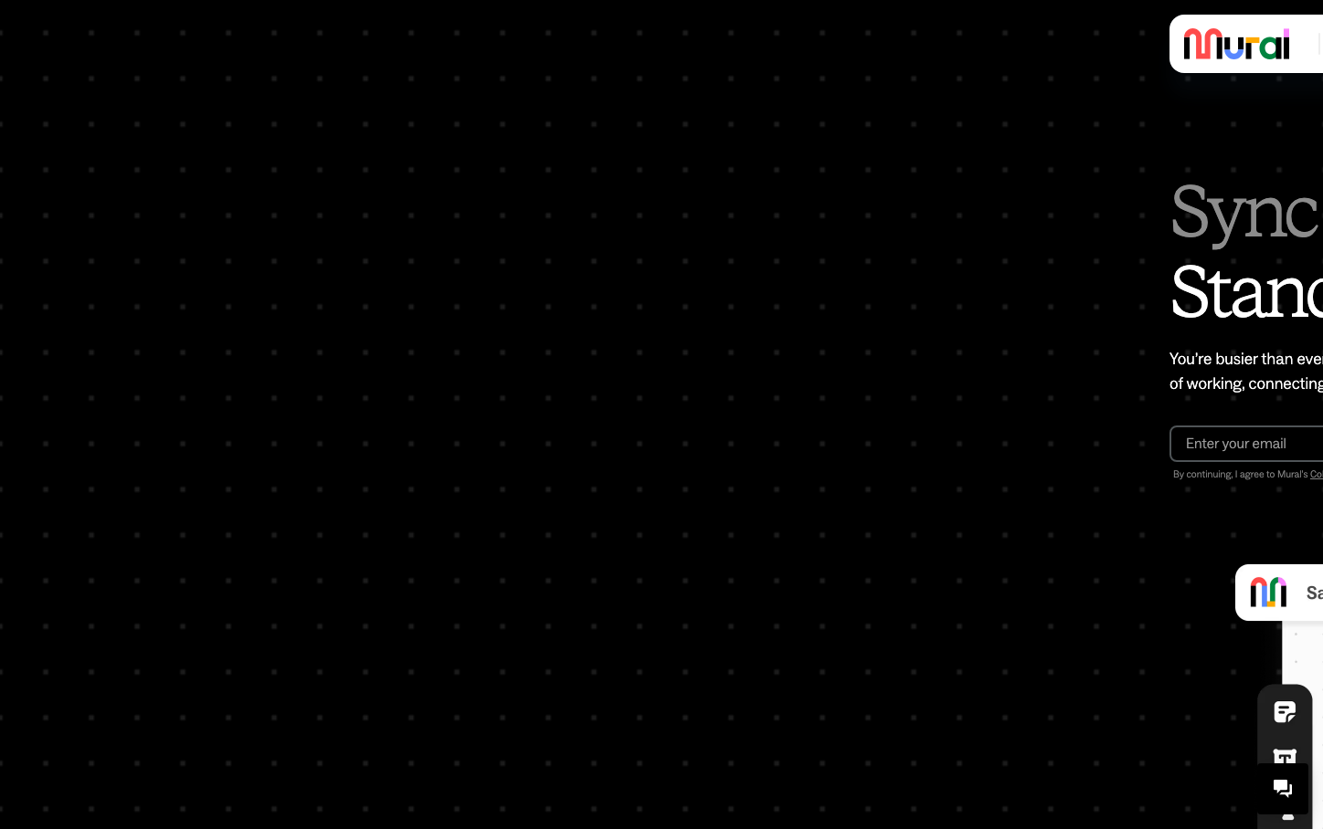
CollaborationMural's brand exudes editorial sophistication through its dramatic contrast between the stark black background and crisp white text, creating a gallery-like atmosphere. The typography tells a story of creative authority - mixing the distinctive serif 'STK Bureau' for headlines with the clean 'ABC Social' for body text, establishing a voice that's both artistic and professional.
Design Identity
Signature Color
Gallery Black
#000000
Creative depth and professional focus - the infinite canvas for collaborative thinking
Visual Identity
The dramatic black void punctuated by white serif typography creates an unmistakable gallery aesthetic that positions digital collaboration as high art.
Component Style
Components feel weightless and refined with subtle shadows (4px default, 12px on hover) that create gentle elevation rather than heavy depth. Forms appear borderless against the dark background, emphasizing content over chrome.
Spacing Philosophy
Generous whitespace creates breathing room that mimics art gallery walls, with content floating in carefully curated zones rather than filling every pixel.
Design Principles
- Typography contrast: Serif headlines (STK Bureau) paired with sans-serif body (ABC Social)
- Consistent 300 font weight across all elements for refined lightness
- Subtle shadow system: 4px default, 12px hover, 24px for elevated states
- Monochromatic palette with strategic color accents
- 16px base font size with 24px line height for optimal readability
Target Audience
Creative professionals and design-conscious teams who value sophisticated tools that match their aesthetic standards and collaborative workflows
Mood
Design descriptions are AI-generated based on visual analysis and may not fully reflect the brand's official design guidelines.
Design System
Typography Scale
| Element | Font | Size | Weight | Line Height |
|---|---|---|---|---|
| body | 16px | 300 | 24px | |
| h1 | 80px | 300 | 88px | |
| h2 | 14px | 300 | 15.4px | |
| h3 | 40px | 300 | 48px | |
| p | 16px | 300 | 24px | |
| a | 16px | 300 | 24px | |
| input | 16px | 300 | 22.8571px | |
| nav | 16px | 300 | 24px | |
| main | 16px | 300 | 24px |
Color Palette
#dce1e5#b8c1cc#4f5457#828c92#666666