Help us build this. Leave comments, suggest improvements, and help create better design documentation for agents.
Muzli
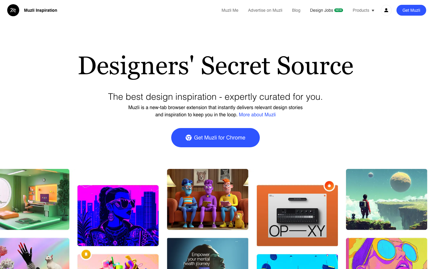
DesignMuzli embodies editorial sophistication with its striking contrast between massive Instrument Serif headlines and clean Poppins sans-serif body text. The brand radiates creative confidence through generous whitespace, vibrant gradient accents, and a curated gallery aesthetic that positions design inspiration as premium content.
Design Identity
Signature Color
Muzli Blue
#4285F4
Creative trust and design authority - the reliable source for curated inspiration
Visual Identity
The dramatic scale contrast between serif headlines and sans-serif body text, combined with expansive whitespace and colorful design showcases arranged in an editorial grid layout.
Component Style
Softly rounded corners with 24px border radius on primary buttons, minimal shadows, gradient backgrounds transitioning from magenta to purple. Cards have subtle borders and generous padding, creating an gallery-like presentation.
Spacing Philosophy
Magazine-editorial spacing with massive 120px+ gaps between hero sections and content blocks. Generous 40-60px padding around major elements creates a premium, uncluttered reading experience that lets design work breathe.
Design Principles
- Headlines use Instrument Serif at 84.8px for maximum impact
- Body text stays at 16px Poppins for optimal readability
- Primary buttons use 24px border radius with gradient backgrounds
- Content grids maintain 32px gaps between design showcase items
- Navigation elements use 14px Poppins at 600 weight for clarity
Target Audience
Design professionals and creative directors who consume inspiration content daily and value expertly curated design showcases over algorithmic feeds
Mood
Design descriptions are AI-generated based on visual analysis and may not fully reflect the brand's official design guidelines.
Design System
Typography Scale
| Element | Font | Size | Weight | Line Height |
|---|---|---|---|---|
| body | 16px | 400 | 24px | |
| h1 | 84.8px | 400 | 116.6px | |
| h2 | 30px | 200 | 41.25px | |
| h3 | 20px | 500 | 30px | |
| h4 | 14px | 400 | 30px | |
| h5 | 18px | 400 | 28px | |
| p | 16px | 400 | 24px | |
| a | 14px | 600 | 20px | |
| nav | 14px | 400 | 20px | |
| header | 14px | 400 | 20px |
Color Palette
#cfd5db#ffffff#d5dee2#946bfe#040608#eaeff2#e9eff4#3b82f6#2d4156#919ea6#d8e0e6#1d2e38