Help us build this. Leave comments, suggest improvements, and help create better design documentation for agents.
Neo Financial
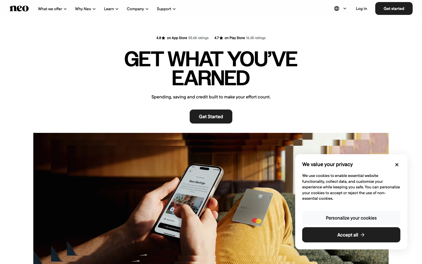
NeobankNeo Financial projects approachable financial sophistication through bold, condensed headings paired with warm, lifestyle-focused imagery. The palette emphasizes trust through neutral grays and whites, creating an atmosphere of stability without corporate sterility.
Design Identity
Signature Color
Neo Charcoal
#3A3A3A
financial reliability with accessible warmth - serious enough for money matters, human enough for everyday banking
Visual Identity
Dramatically oversized typography with ultra-condensed line spacing creates immediate impact, while lifestyle photography showing real hands and everyday moments humanizes the financial experience
Component Style
Softly rounded corners at 12px with minimal shadows - buttons feel substantial but approachable, avoiding sharp corporate edges. Clean white backgrounds with subtle gray borders maintain professionalism without intimidation.
Spacing Philosophy
Generous vertical breathing room around hero sections contrasts with tightly-packed headline typography, creating dramatic focal points while maintaining comfortable reading zones for body content.
Design Principles
- Border radius consistently 12px across all interactive elements
- Headlines use extreme vertical compression with 64.8px line-height on 72px text
- Body text maintains comfortable 24px line-height for readability
- Color palette restricted to neutrals with strategic black for emphasis
- Typography mixing creates hierarchy: Owners serif for impact, TT Commons for utility
Target Audience
Millennial and Gen-Z Canadians who want sophisticated financial tools without traditional banking intimidation - digitally native but value human connection
Mood
Design descriptions are AI-generated based on visual analysis and may not fully reflect the brand's official design guidelines.
Design System
Typography Scale
| Element | Font | Size | Weight | Line Height |
|---|---|---|---|---|
| body | 16px | 400 | 24px | |
| h1 | 72px | 500 | 64.8px | |
| h2 | 30px | 600 | 36px | |
| h3 | 24px | 600 | 28.8px | |
| p | 14px | 500 | 19.6px | |
| a | 16px | 400 | 24px | |
| button | 16px | 400 | 24px | |
| nav | 16px | 400 | 24px | |
| header | 16px | 400 | 24px | |
| footer | 16px | 400 | 24px |
Color Palette
#bbc3ca#ffffff#f7f9fa#e9edf0