Help us build this. Leave comments, suggest improvements, and help create better design documentation for agents.
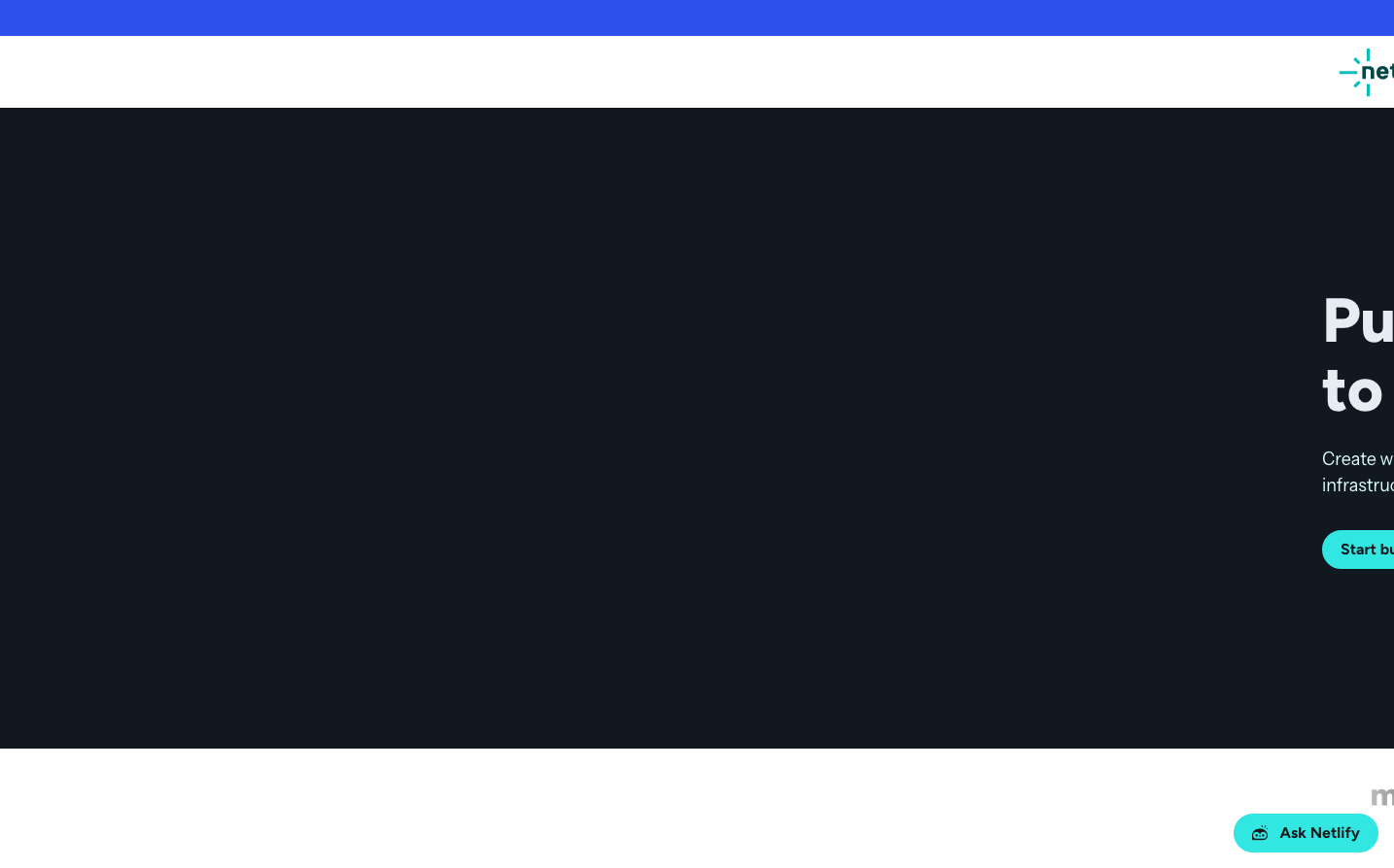
Netlify
Dev ToolsNetlify creates a developer-first aesthetic where vibrant cyan energy meets dark sophistication. The brand balances technical precision through monospace typography with human approachability via rounded corners and generous spacing, communicating that powerful web infrastructure doesn't have to feel intimidating.
Design Identity
Signature Color
Netlify Cyan
#32e6e2
Electric innovation and developer-focused energy - the color of code that just works
Visual Identity
The distinctive split between dark hero sections and bright accent colors creates an unmistakable 'developer by night' aesthetic, where cyan highlights feel like syntax highlighting come to life.
Component Style
Buttons use generous 8-16px border radius with solid fills and no shadows, creating approachable yet confident interactions. Components favor clean fills over outlines, with the signature cyan reserved for primary actions that demand attention.
Spacing Philosophy
Generous whitespace creates breathing room for complex concepts, with large padding around CTAs (likely 16-24px) and substantial section gaps that let dark backgrounds feel expansive rather than cramped.
Design Principles
- Border radius stays between 8-16px for primary components, never sharp or overly rounded
- Typography mixes three families: Figtree for bold headlines, Instrument Sans for body, Martian Mono for technical elements
- Cyan (#32e6e2) is reserved exclusively for primary actions and brand moments
- Dark backgrounds (#1b205b, near-black) create contrast stages for bright accent colors
- Button text uses 14px at 600 weight for confident readability
Target Audience
Frontend developers and DevOps engineers who appreciate craft and want their deployment tools to feel as polished as their code
Mood
Design descriptions are AI-generated based on visual analysis and may not fully reflect the brand's official design guidelines.
Design System
Typography Scale
| Element | Font | Size | Weight | Line Height |
|---|---|---|---|---|
| body | 16px | 400 | 24px | |
| h1 | 64px | 800 | 70.4px | |
| h2 | 48.64px | 800 | 53.504px | |
| h3 | 12px | 500 | 13.2px | |
| p | 14px | 600 | 21px | |
| a | 14px | 600 | 21px | |
| button | 14px | 600 | 21px | |
| input | 16px | 400 | 24px | |
| nav | 16px | 400 | 24px | |
| header | 16px | 400 | 24px |
Color Palette
#d1d5da#1b205b#2e51ed#e9ebed#ffffff#778089#603408#edf4ff#f98e21#64d87f#8efbf7#32e6e2