Help us build this. Leave comments, suggest improvements, and help create better design documentation for agents.
Nykaa
E-commerceNykaa embodies beauty democratization through an energetic hot pink signature that radiates confidence and accessibility. The design balances aspirational beauty content with approachable, feminine energy - creating a playground for beauty exploration rather than intimidating luxury.
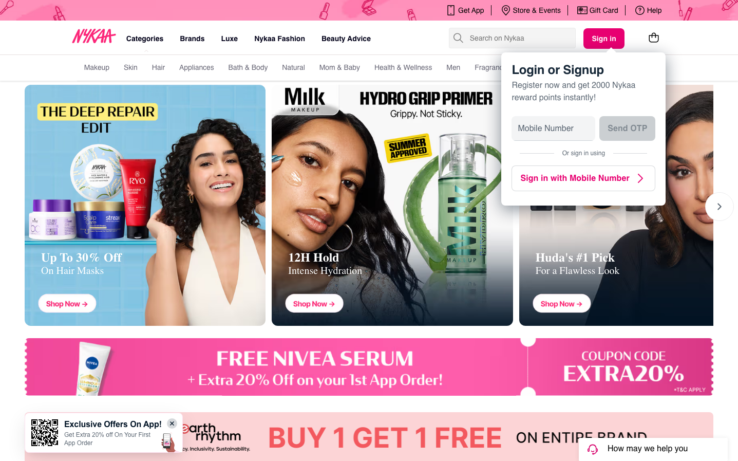
Design Identity
Signature Color
Nykaa Hot Pink
#E91E63
beauty empowerment and feminine confidence - bold enough to stand out in beauty retail while remaining approachable
Visual Identity
The distinctive hot pink banner promotions and pill-shaped buttons create an unmistakable beauty-focused e-commerce experience that feels more like a beauty magazine than a sterile marketplace.
Component Style
Soft rounded corners with 24px+ border radius on primary buttons, creating pill-like shapes. Cards have subtle shadows and gentle curves. Everything feels approachable and tactile rather than sharp or clinical.
Spacing Philosophy
Dense, magazine-style layout with minimal gaps between hero banners, maximizing visual impact. Tight 8-12px internal spacing keeps the interface compact while large 40px+ button targets ensure mobile usability.
Design Principles
- Primary buttons always use pill-shaped 24px+ border radius
- Hot pink (#E91E63) reserved exclusively for primary actions and key messaging
- Hero banners fill maximum width with minimal gaps between sections
- Typography uses Inter at 14px base with 600 weight for emphasis
- Login/signup flows use clean white overlays with generous padding
Target Audience
Beauty enthusiasts aged 18-35 who want accessible luxury and are comfortable shopping on mobile-first platforms
Mood
Design descriptions are AI-generated based on visual analysis and may not fully reflect the brand's official design guidelines.
Design System
Typography Scale
| Element | Font | Size | Weight | Line Height |
|---|---|---|---|---|
| body | 14px | 400 | 14px | |
| h1 | 20px | 600 | 24px | |
| h2 | 14px | 600 | 20px | |
| a | 16px | 500 | 40px | |
| button | 14px | 400 | 16.1px | |
| input | 14px | 400 | 34px | |
| nav | 14px | 400 | 14px | |
| header | 14px | 400 | 14px |
Color Palette
No colors extracted


