Help us build this. Leave comments, suggest improvements, and help create better design documentation for agents.
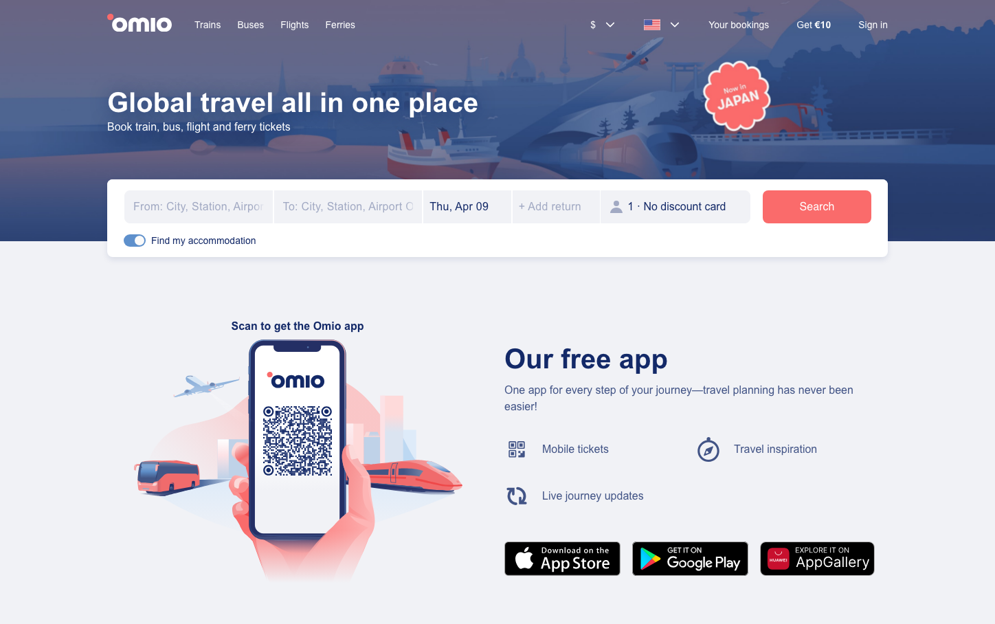
Omio
TravelOmio creates a dreamy, wanderlust-inducing aesthetic through a dramatic twilight gradient backdrop that transitions from deep purple to warm coral, overlaid with illustrated transportation modes. The GT Walsheim typography feels approachable yet sophisticated, balancing travel excitement with booking confidence through generous whitespace and a floating search interface.
Design Identity
Signature Color
Coral Journey
#FF6B6B
Adventure optimism and booking confidence - warm enough to inspire wanderlust, bold enough to drive conversions
Visual Identity
Cinematic gradient backgrounds with floating white content cards that feel suspended in a dreamy travel atmosphere, combined with subtle transportation illustrations woven into the landscape
Component Style
Soft, approachable components with moderate 6-8px border radius. White floating cards with subtle shadows create depth against gradient backgrounds. Buttons have gentle curves and the coral primary creates warm, inviting interactions.
Spacing Philosophy
Generous breathing room with 56px desktop padding creates a premium, uncluttered booking experience. Large whitespace sections prevent decision paralysis while maintaining focus on the core search functionality.
Design Principles
- Gradient backgrounds always transition from cool to warm tones
- Primary actions use coral (#FF6B6B) with 6px border radius
- White floating cards maintain consistent subtle drop shadows
- Typography hierarchy uses 16px base with 32px/40px headers
- Transportation illustrations integrate naturally into landscapes
Target Audience
Millennial and Gen-Z leisure travelers who value seamless multi-modal booking experiences and are inspired by visual storytelling
Mood
Design descriptions are AI-generated based on visual analysis and may not fully reflect the brand's official design guidelines.
Design System
Typography Scale
| Element | Font | Size | Weight | Line Height |
|---|---|---|---|---|
| body | 16px | 400 | 18.4px | |
| h1 | 32px | 700 | 36.8px | |
| h2 | 40px | 700 | 36px | |
| h3 | 16px | 700 | 24px | |
| p | 16px | 400 | 24px | |
| a | 16px | 400 | 18.4px | |
| button | 14px | 400 | 24px | |
| input | 16px | 400 | 18.4px | |
| nav | 16px | 400 | 18.4px | |
| header | 16px | 400 | 18.4px |
Color Palette
No colors extracted