Help us build this. Leave comments, suggest improvements, and help create better design documentation for agents.
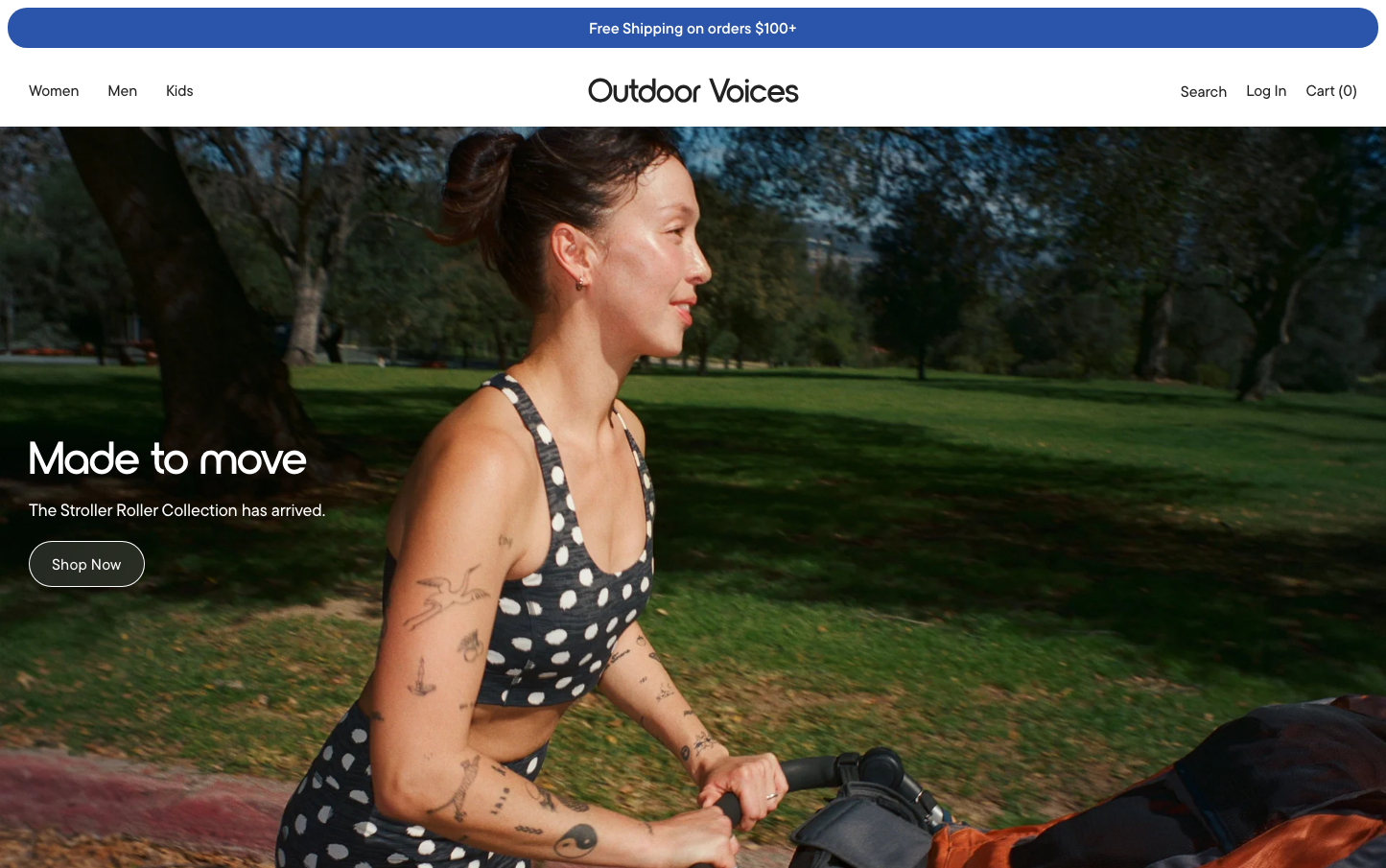
Outdoor Voices
E-commerceOutdoor Voices embraces understated athleticism with a sophisticated grayscale palette that evokes mindful movement rather than aggressive competition. The TTCommonsPro and NordiquePro typography creates a refined, almost editorial feel that elevates activewear into lifestyle territory.
Design Identity
Signature Color
Outdoor Navy
#2b54ab
Trustworthy depth and outdoor reliability - not flashy performance but steady commitment to movement
Visual Identity
Generous whitespace and minimal contrast creates a zen-like calm that distinguishes it from high-energy fitness brands - it's activewear for mindful movers, not gym warriors.
Component Style
Extremely subtle borders with minimal 1px radius - components feel whisper-light with barely-there #d2d2d2 borders and no shadows, creating an almost invisible interface that doesn't compete with content.
Spacing Philosophy
Restrained spacing system maxing at 18px creates intimate, approachable layouts - nothing feels overwhelming or athletic-aggressive, maintaining human-scale proportions.
Design Principles
- Border radius never exceeds 1px - form inputs and components stay crisp
- Typography mixes three fonts: TTCommonsPro for headers, NordiquePro for emphasis, Noto Sans for UI
- Button weight is heavy at 700 to contrast the otherwise light interface
- Grayscale dominance with strategic blue accent usage
- Transitions are quick at 0.2s to feel responsive but not flashy
Target Audience
Urban professionals who view fitness as self-care rather than competition - people who do yoga, walk to work, and value movement as meditation over performance metrics.
Mood
Design descriptions are AI-generated based on visual analysis and may not fully reflect the brand's official design guidelines.
Design System
Typography Scale
| Element | Font | Size | Weight | Line Height |
|---|---|---|---|---|
| body | 16px | 500 | 22.4px | |
| h1 | 80px | 500 | 88px | |
| h2 | 30px | 600 | 36px | |
| h3 | 36px | 500 | 43.2px | |
| p | 16px | 400 | 22.4px | |
| a | 16px | 500 | 22.4px | |
| button | 15.024px | 700 | normal | |
| input | 14px | 500 | 19.6px | |
| nav | 16px | 500 | 22.4px | |
| header | 16px | 500 | 22.4px |
Color Palette
#222222#737373#979797#8b8b8b#f8f8f8#d1d1d1#e6e6e6#2b54ab#ffffff#b72121#dd000d#000000


