Help us build this. Leave comments, suggest improvements, and help create better design documentation for agents.
OVO
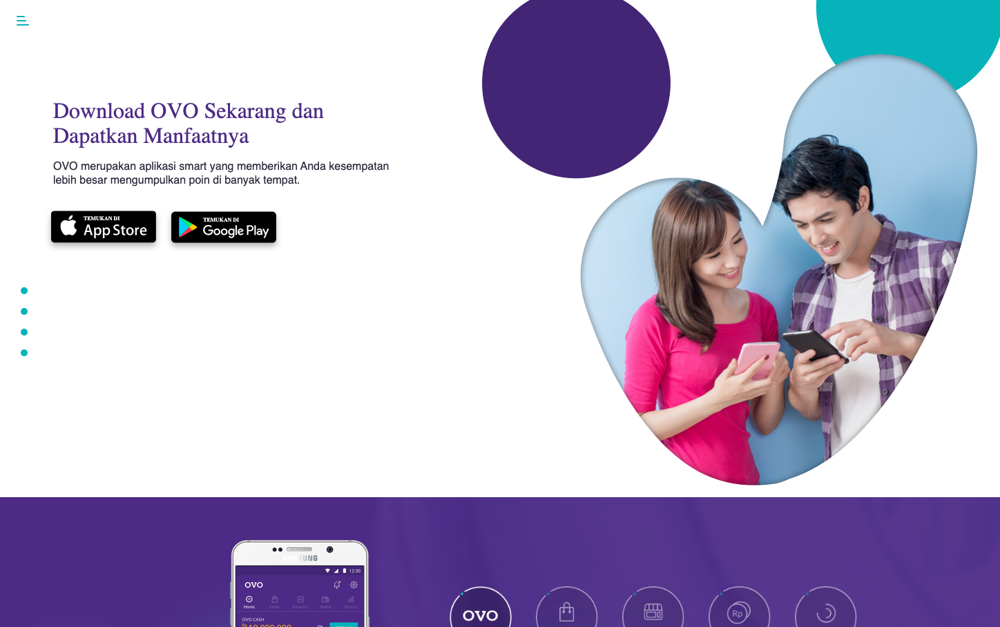
FintechOVO leverages a bold purple-to-teal gradient aesthetic that feels both playful and premium, targeting Indonesian mobile-first financial users. The organic, flowing shapes create an approachable contrast to traditional fintech sterility, while the warm photography of couples using phones together emphasizes community and shared financial experiences.
Design Identity
Signature Color
OVO Purple
#663399
Indonesian fintech accessibility with premium trust
Visual Identity
Organic, flowing geometric shapes in purple and teal that create dynamic negative space - instantly recognizable bubble-like compositions that feel warm and human rather than corporate.
Component Style
App store badges are clean with subtle shadows, the phone mockup has realistic depth, and the overall composition uses soft, rounded organic shapes rather than rigid containers - everything feels approachable and tactile.
Spacing Philosophy
Generous whitespace on the left creates breathing room for content, while the right side uses overlapping organic shapes to create visual interest - balancing openness with dynamic energy.
Design Principles
- Typography mixes serif headers (Roboto Slab 32px) with sans-serif body (Helvetica Neue 16px) for approachable authority
- Organic shapes never have sharp corners - everything flows
- Purple dominates but teal provides energetic contrast
- Real photography shows actual product usage rather than abstract concepts
- Mobile-first layout with clear download CTAs
Target Audience
Indonesian millennials and Gen Z users who want accessible digital payments with a friendly, community-focused approach rather than intimidating banking experiences
Mood
Design descriptions are AI-generated based on visual analysis and may not fully reflect the brand's official design guidelines.
Design System
Typography Scale
| Element | Font | Size | Weight | Line Height |
|---|---|---|---|---|
| body | 16px | 400 | 24px | |
| h1 | 32px | 400 | 36px | |
| h2 | 37px | 400 | 51.8px | |
| h5 | 16px | 400 | 20px | |
| h6 | 16px | 400 | 22.4px | |
| a | 16px | 400 | 24px | |
| input | 16px | 400 | 24px | |
| nav | 16px | 400 | 24px | |
| header | 16px | 400 | 24px | |
| footer | 16px | 400 | 24px |
Color Palette
No colors extracted