Help us build this. Leave comments, suggest improvements, and help create better design documentation for agents.
PagSeguro
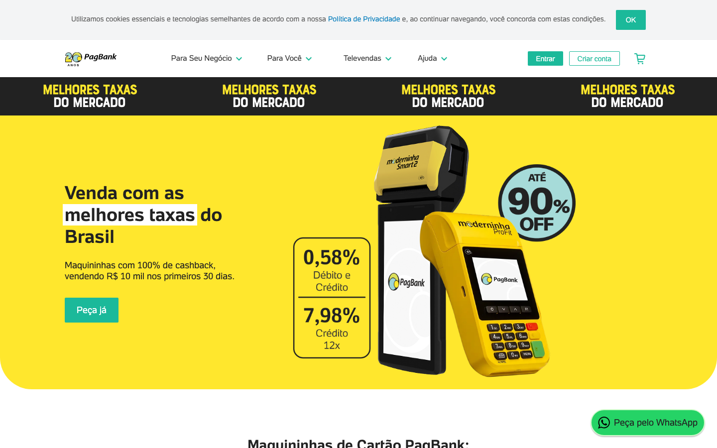
FintechPagBank's brand radiates Brazilian fintech confidence through an energetic yellow-dominant design that feels both approachable and professional. The bold, repetitive messaging 'MELHORES TAXAS DO MERCADO' creates urgency while the friendly rounded typography maintains trust and accessibility.
Design Identity
Signature Color
Brazilian Gold
#FFD700
Brazilian optimism and financial opportunity - warm, trustworthy, and distinctive in the fintech space
Visual Identity
The bold yellow background with repeating banner text creates an unmistakable carnival-like energy that's distinctly Brazilian, combined with product-focused hero imagery showing actual payment terminals
Component Style
Buttons feature moderate rounding (8-12px) with solid fills and clean typography. The design favors bold color blocks over subtle shadows or borders, creating a confident, accessible feel rather than premium minimalism.
Spacing Philosophy
Generous yellow canvas with concentrated content areas. The design uses dramatic color blocking to create visual separation rather than relying on whitespace, with tight internal spacing that keeps information dense and scannable.
Design Principles
- Yellow dominates at least 70% of hero sections
- Typography weight stays at 400-700 range for accessibility
- Repetitive messaging creates urgency and memorability
- Product imagery always shows real devices, not illustrations
- Discount badges use high contrast circles for immediate attention
Target Audience
Brazilian small business owners and entrepreneurs who need straightforward payment solutions without fintech complexity
Mood
Design descriptions are AI-generated based on visual analysis and may not fully reflect the brand's official design guidelines.
Design System
Typography Scale
| Element | Font | Size | Weight | Line Height |
|---|---|---|---|---|
| body | 14px | 400 | 20px | |
| h1 | 36px | 700 | 44px | |
| h2 | 28px | 700 | 32px | |
| h3 | 24px | 400 | 28px | |
| p | 14px | 400 | 16px | |
| a | 14px | 400 | 16px | |
| button | 14px | 400 | 20px | |
| input | 16px | 400 | normal | |
| nav | 14px | 400 | 20px | |
| header | 14px | 400 | 20px |
Color Palette
No colors extracted


