Help us build this. Leave comments, suggest improvements, and help create better design documentation for agents.
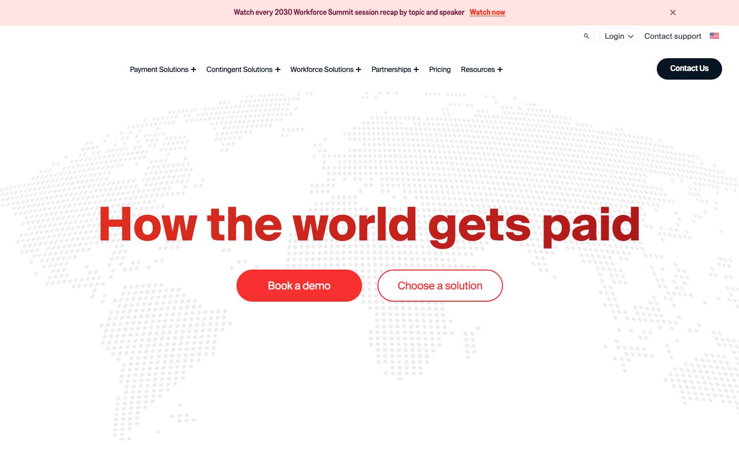
Papaya Global
HR TechPapaya Global commands attention with massive, bold headlines in Suisse typeface that create an almost architectural presence on the page. The striking red (#E53E3E) hero text against a subtle world map background evokes urgency and global reach, while the clean navigation maintains professional restraint.
Design Identity
Signature Color
Papaya Red
#E53E3E
urgent global action and payroll reliability
Visual Identity
Oversized typography as hero elements - headlines that feel like architectural statements rather than text, creating dramatic scale contrast with minimal supporting elements.
Component Style
Buttons use generous rounded corners (approximately 24-32px) with solid fills and clean edges. Primary actions are bold red while secondary actions use outline treatment. No shadows - everything feels flat and decisive.
Spacing Philosophy
Massive vertical breathing room around the hero headline creates dramatic focus, while horizontal navigation elements are tightly spaced for efficiency. The typography itself becomes the main visual element through sheer scale.
Design Principles
- Headlines use 90px Suisse at 700 weight for maximum impact
- Red accent color reserved only for primary actions and key messaging
- Button corners consistently rounded to 24-32px radius
- No drop shadows or gradients - purely flat design approach
- World map overlay uses subtle opacity to avoid competing with text
Target Audience
Global HR executives and finance leaders who need to project authority while managing complex international payroll operations
Mood
Design descriptions are AI-generated based on visual analysis and may not fully reflect the brand's official design guidelines.
Design System
Typography Scale
| Element | Font | Size | Weight | Line Height |
|---|---|---|---|---|
| body | 16px | 400 | 24px | |
| h1 | 90px | 700 | 113.13px | |
| h2 | 50px | 600 | 65px | |
| h3 | 50px | 600 | 65px | |
| h4 | 16px | 500 | 24px | |
| h6 | 13px | 400 | 23.4px | |
| p | 13px | 400 | 23.4px | |
| a | 16px | 700 | 28.8px | |
| button | 16px | 400 | 24px | |
| input | 14px | 400 | 16.8px |
Color Palette
#253872#ffffff