Help us build this. Leave comments, suggest improvements, and help create better design documentation for agents.
Patagonia
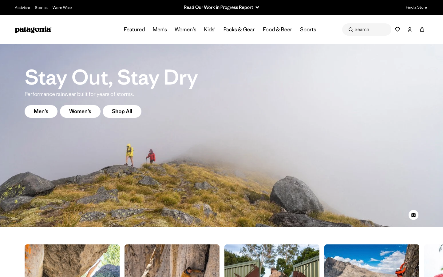
ConsumerPatagonia's brand embodies rugged outdoor adventure through expansive nature photography and minimal white pill-style buttons that float against stormy landscapes. The signature look blends ethereal outdoor cinematography with clean, understated UI elements that never compete with the natural beauty they showcase.
Design Identity
Signature Color
Alpine White
#FFFFFF
Pure, unobtrusive functionality that respects nature's dominance - gear that gets out of the way
Visual Identity
Hero imagery dominates the viewport with small, pill-shaped white buttons that appear to float weightlessly over dramatic outdoor photography, creating a sense of humans as respectful visitors in nature's vastness.
Component Style
Soft pill buttons with generous 24px border radius and clean white fills - no shadows or heavy borders, designed to feel lightweight and unobtrusive against nature photography. Everything has a gentle, approachable softness.
Spacing Philosophy
Massive breathing room around hero elements with generous 32px+ gaps between action buttons, creating a sense of open wilderness. Typography floats with ample whitespace, mimicking the vastness of outdoor landscapes.
Design Principles
- Border radius uses soft 24px+ pills for primary actions
- White/light buttons over dark imagery for maximum contrast
- Typography hierarchy jumps dramatically from 64px headlines to 16px body
- Hero images consume 80%+ of viewport height
- Interactive elements cluster in small groups with generous spacing
Target Audience
Conscious outdoor enthusiasts who prioritize environmental responsibility over flashy gear - people who see nature as sacred and want brands that respect that relationship
Mood
Design descriptions are AI-generated based on visual analysis and may not fully reflect the brand's official design guidelines.
Design System
Typography Scale
| Element | Font | Size | Weight | Line Height |
|---|---|---|---|---|
| body | 14px | 300 | 24.5px | |
| h1 | 64px | 500 | 70.4px | |
| h2 | 48px | 500 | 52.8px | |
| h3 | 40px | 500 | 44px | |
| h4 | 14px | 500 | 21px | |
| h5 | 14px | 300 | 21px | |
| p | 16px | 500 | 17.6px | |
| a | 14px | 300 | 30px | |
| button | 12px | 300 | 18px | |
| input | 14px | 300 | 24.5px |
Color Palette
#007aff#fff1cd#d63384#fafafa#cccccc#000000#d6f0e4#e2e3e5#91abe9#ffffff#dee2e6#e9eefb

