Help us build this. Leave comments, suggest improvements, and help create better design documentation for agents.
Paytm
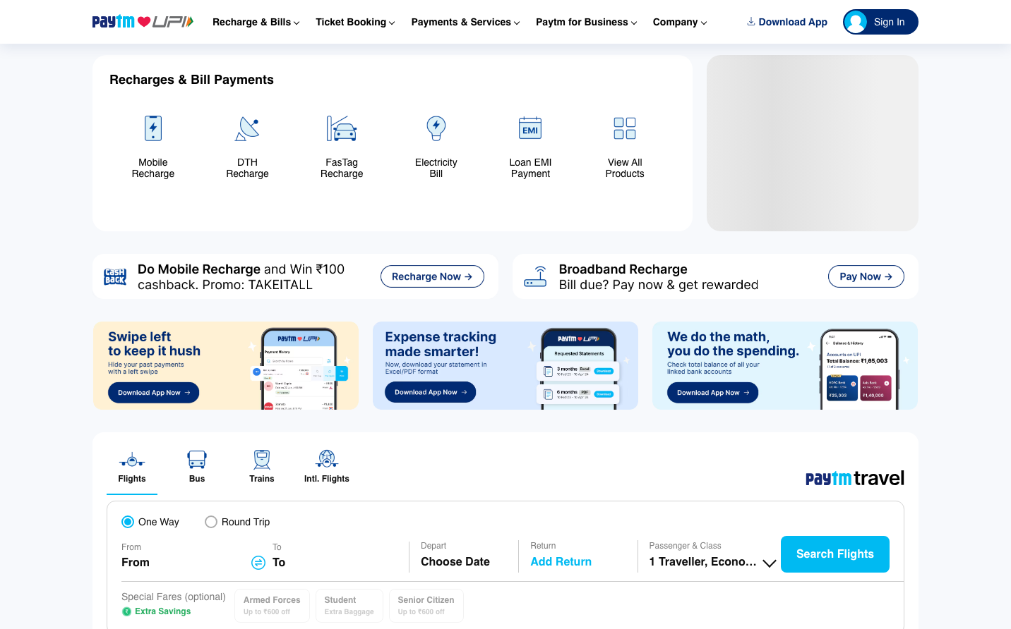
FintechPaytm embodies pragmatic digital utility through its signature cyan blue and no-nonsense card-based interface. The design prioritizes functional density over visual flair, creating an atmosphere of reliable financial service efficiency rather than premium banking elegance.
Design Identity
Signature Color
Paytm Cyan
#00BAF2
accessible digital trust and everyday utility
Visual Identity
Dense grid of service cards with simple line icons on clean backgrounds - the layout screams 'super app' functionality where every pixel serves a transactional purpose
Component Style
Moderate 8px rounded corners with subtle drop shadows on white cards. Buttons feel substantial with bold typography and generous padding. Everything has a friendly-but-efficient government portal aesthetic rather than sleek fintech minimalism.
Spacing Philosophy
Compact 16-24px gaps between service tiles maximize screen real estate, while generous internal card padding (24px+) ensures touch-friendly interactions. The rhythm prioritizes information density over breathing room.
Design Principles
- Service icons use consistent outline style with 2px stroke weight
- Card shadows are always subtle - never dramatic depth
- Primary actions use cyan, secondary actions use white/gray
- Typography hierarchy uses only Inter at 12px, 14px, and 16px sizes
- Border radius consistently at 8px for all interactive elements
Target Audience
Middle-class Indian consumers who need one app for everything - from mobile recharge to flight booking - and value functionality over aesthetic sophistication
Mood
Design descriptions are AI-generated based on visual analysis and may not fully reflect the brand's official design guidelines.
Design System
Typography Scale
| Element | Font | Size | Weight | Line Height |
|---|---|---|---|---|
| body | 14px | 400 | normal | |
| h1 | 14px | 700 | normal | |
| h2 | 12px | 700 | 20px | |
| p | 12px | 400 | 20px | |
| a | 14px | 600 | normal | |
| button | 16px | 700 | normal | |
| input | 14px | 500 | normal | |
| nav | 14px | 400 | normal | |
| header | 14px | 400 | normal | |
| footer | 14px | 400 | normal |
Color Palette
No colors extracted


