Help us build this. Leave comments, suggest improvements, and help create better design documentation for agents.
Pedidos Ya
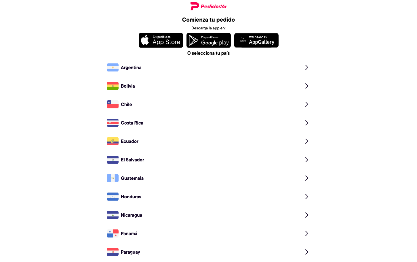
FoodPedidosYa embraces a bold, culturally-connected aesthetic that celebrates Latin American diversity through vibrant flag iconography and energetic pink branding. The typography feels approachable yet confident with TT Commons Pro creating a friendly professionalism that speaks to everyday food delivery users across multiple countries.
Design Identity
Signature Color
PedidosYa Hot Pink
#FF1744
energetic Latin appetite - boldness that cuts through cultural barriers with food-focused urgency
Visual Identity
The distinctive country flag grid layout with geometric precision - each flag sits in perfect alignment with clean spacing, creating a passport-like directory that immediately signals international food delivery reach.
Component Style
Clean list items with generous padding and subtle right-pointing chevrons. Components feel substantial without weight - flags are crisp geometric rectangles, text has breathing room, and the overall treatment is minimal but purposeful with no shadows or heavy borders.
Spacing Philosophy
Generous vertical rhythm between country selections creates digestible chunks, while the centered layout with ample side margins feels mobile-first and thumb-friendly. The spacing suggests patience rather than density.
Design Principles
- Flag icons maintain consistent 24px height with 3:2 aspect ratio
- Country list items use identical 56px vertical spacing
- Typography hierarchy limited to 20px headers, 16px body, 600/400 weights only
- Centered content never exceeds 400px width for mobile optimization
- Color palette restricted to flags, signature pink, and neutral grays
Target Audience
Latin American mobile-first users aged 18-45 who value cultural connection and expect seamless cross-border food delivery experiences
Mood
Design descriptions are AI-generated based on visual analysis and may not fully reflect the brand's official design guidelines.
Design System
Typography Scale
| Element | Font | Size | Weight | Line Height |
|---|---|---|---|---|
| body | 16px | 400 | normal | |
| h1 | 20px | 600 | 24px | |
| h2 | 16px | 600 | 20px | |
| a | 16px | 400 | normal | |
| nav | 16px | 400 | normal | |
| footer | 16px | 400 | normal |
Color Palette
No colors extracted


