Help us build this. Leave comments, suggest improvements, and help create better design documentation for agents.
Penpot
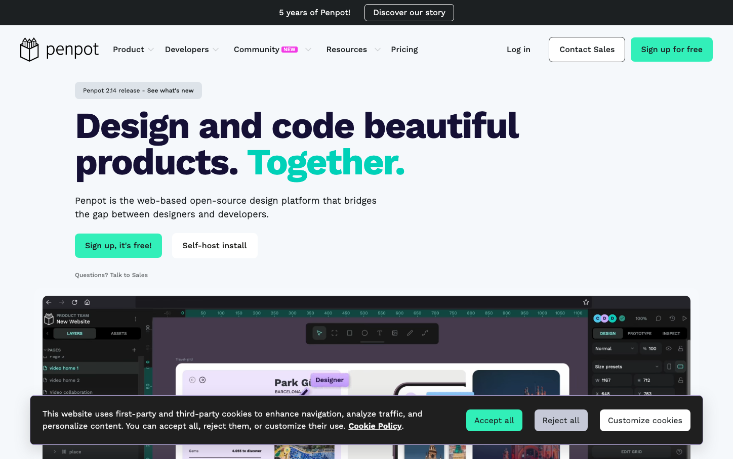
Design ToolsPenpot combines a vibrant mint-green accent with a structured, developer-focused aesthetic that bridges creative and technical worlds. The design feels purposeful and collaborative, with clean typography and generous whitespace that emphasizes functionality without sacrificing visual appeal.
Design Identity
Signature Color
Penpot Mint
#31EFB8
Creative-technical fusion - energizing collaboration between designers and developers
Visual Identity
The distinctive mint-green accent color paired with dark navy headings and generous whitespace creates an unmistakable design-tool aesthetic that feels both technical and approachable.
Component Style
Rounded corners (6-8px) with solid fill buttons and minimal shadows. Components feel substantial but not heavy, with clear hierarchy through color rather than elevation. The mint-green CTA buttons have a confident, clickable presence.
Spacing Philosophy
Generous vertical rhythm with large gaps between sections (48px+) creates breathing room, while consistent 16-24px internal padding keeps components organized. The layout prioritizes readability over density.
Design Principles
- Border radius stays within 6-8px range for friendly but professional feel
- Typography uses Work Sans exclusively with clear weight hierarchy (400, 700)
- Mint green reserved for primary actions and key highlights only
- Dark navy (#1c2022) for headings, standard text stays readable but softer
- Generous line-height (1.5x) maintains excellent readability
Target Audience
Design-forward developers and technically-minded designers who value open-source tools and collaborative workflows over enterprise polish
Mood
Design descriptions are AI-generated based on visual analysis and may not fully reflect the brand's official design guidelines.
Design System
Typography Scale
| Element | Font | Size | Weight | Line Height |
|---|---|---|---|---|
| body | 16px | 400 | normal | |
| h1 | 72px | 700 | 72px | |
| h2 | 54px | 700 | 59.4px | |
| h3 | 32px | 700 | 38.4px | |
| h4 | 18px | 700 | 27px | |
| p | 20px | 400 | 30px | |
| a | 16px | 400 | 24px | |
| button | 16px | 400 | 24px | |
| input | 16px | 400 | 24px | |
| nav | 16px | 400 | 24px |
Color Palette
#1677ff#52c41a#faad14#ff4d4f#1c2022#ffffff#f5f5f5#d9d9d9#f0f0f0#e6f4ff#bae0ff#91caff