Help us build this. Leave comments, suggest improvements, and help create better design documentation for agents.
Perplexity
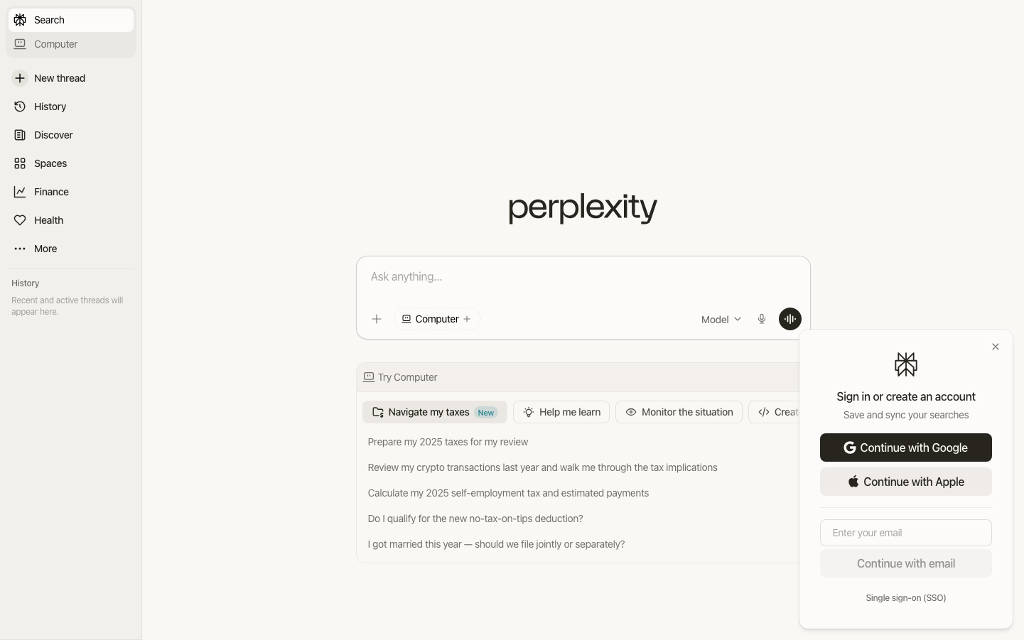
AIPerplexity embodies intellectual minimalism with its warm cream background and ethereal lowercase wordmark, creating an atmosphere of scholarly contemplation. The design feels like a digital library reading room - spacious, focused, and designed for deep thinking rather than hurried interactions.
Design Identity
Signature Color
Scholar Cream
#faf8f5
thoughtful sophistication and knowledge accessibility
Visual Identity
The distinctive lowercase 'perplexity' wordmark in elegant serif typography, combined with the warm cream background that feels more like paper than digital screen.
Component Style
Soft, pill-shaped buttons with generous padding and subtle backgrounds. Cards have gentle rounded corners with minimal shadows. Everything feels organic and approachable rather than sharp or corporate.
Spacing Philosophy
Luxuriously airy with massive central whitespace that forces focus on the core interaction. The sidebar is compact while the main area breathes with scholarly generosity.
Design Principles
- Typography uses custom pplxSans font family for warmth over technical precision
- 16px base font size with 400 weight maintains readability without assertiveness
- Background colors favor warm creams (#faf8f5, #fdfbfa) over stark whites
- Minimal page padding (16px) keeps content accessible on mobile
- Shadows are extremely subtle (#0000000d) for barely-there depth
Target Audience
Knowledge workers, researchers, and curious minds who value depth over speed - people who ask complex questions rather than seek quick answers
Mood
Design descriptions are AI-generated based on visual analysis and may not fully reflect the brand's official design guidelines.
Design System
Typography Scale
| Element | Font | Size | Weight | Line Height |
|---|---|---|---|---|
| body | 16px | 400 | 24px | |
| p | 16px | 400 | 24px | |
| a | 16px | 400 | 24px | |
| button | 16px | 400 | 24px | |
| input | 16px | 400 | 24px | |
| nav | 16px | 400 | 24px | |
| main | 16px | 400 | 24px |
Color Palette
#3053b3#016a71#97431a#3b82f6#27251e#271a00#000000#016b1d#825503#a23544#006495#536300