Help us build this. Leave comments, suggest improvements, and help create better design documentation for agents.
Pizza Hut
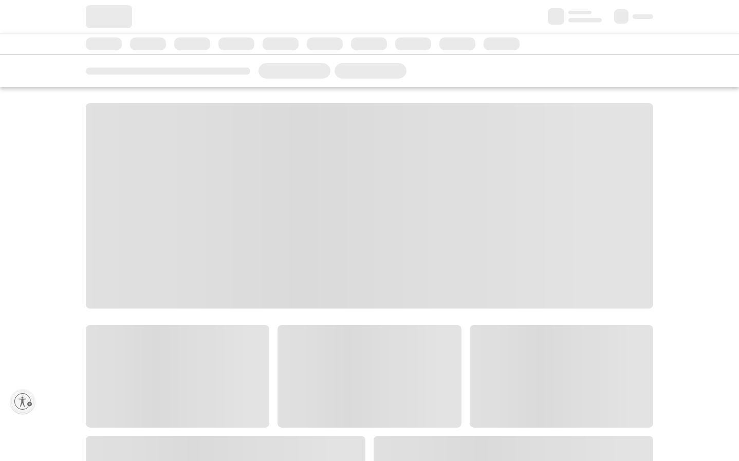
FoodPizza Hut's digital identity embraces extreme minimalism with stark grayscale wireframes that feel deliberately unfinished, creating an unexpectedly raw and utilitarian aesthetic. The custom FeedGoodType headlines paired with Open Sans body text suggests approachable premium casual dining, while the generous whitespace and skeletal layout prioritize content digestibility over visual flourish.
Design Identity
Signature Color
Charcoal Black
#131313
Bold simplicity and no-nonsense food focus - cutting through the noise of flashy food marketing
Visual Identity
Stark wireframe-like layouts with massive amounts of whitespace and minimal visual hierarchy - instantly recognizable by what's NOT there rather than what is
Component Style
Pill-shaped buttons with 50px border radius create friendly, approachable touchpoints against the stark minimalism. Components feel deliberately understated with soft curves contrasting the rigid grid system.
Spacing Philosophy
Extremely generous whitespace dominates the layout, creating a sense of premium restraint uncommon in fast-casual dining brands. Large content blocks float in vast empty spaces.
Design Principles
- Button border radius locked at 50px for pill shapes
- Typography limited to FeedGoodType for headlines (36px/24px) and Open Sans for everything else
- Form borders use stark #131313 black for definition
- Body text maintains 14px with 21px line-height for readability
- Whitespace-first approach with minimal visual elements
Target Audience
Busy families and young professionals who want familiar comfort food without the visual overwhelm of typical fast-food marketing
Mood
Design descriptions are AI-generated based on visual analysis and may not fully reflect the brand's official design guidelines.
Design System
Typography Scale
| Element | Font | Size | Weight | Line Height |
|---|---|---|---|---|
| body | 14px | 400 | 21px | |
| h1 | 36px | 400 | 47.88px | |
| h2 | 24px | 400 | 30px | |
| p | 14px | 600 | 21px | |
| a | 14px | 400 | 18px | |
| button | 18px | 600 | 31.5px | |
| header | 14px | 400 | 21px | |
| footer | 14px | 400 | 21px | |
| body | 14px | 400 | 21px | |
| h1 | 36px | 400 | 47.88px |
Color Palette
#131313


