Help us build this. Leave comments, suggest improvements, and help create better design documentation for agents.
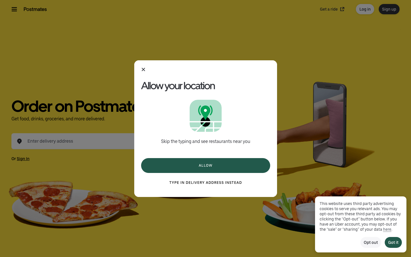
Postmates
FoodPostmates embraces a warm, golden-hour aesthetic that feels approachable yet premium, using rich mustard yellows and earthy tones to create hunger-inducing comfort. The typography hierarchy balances bold, confident headlines with gentle body text, telling a story of reliable convenience wrapped in friendly sophistication.
Design Identity
Signature Color
Postmates Golden Mustard
#B8860B
Warmth and appetite appeal - evokes the golden hour of dinner time and comfort food cravings
Visual Identity
The distinctive warm golden-yellow background combined with food photography and gentle rounded corners creates an immediately recognizable comfort-food atmosphere that feels like a cozy kitchen rather than a sterile tech platform.
Component Style
Soft, approachable components with generous rounded corners (8-12px), minimal shadows, and warm color fills. Buttons feel pillowy and inviting rather than sharp or aggressive, with emphasis on comfort over precision.
Spacing Philosophy
Generous breathing room with large hero sections and comfortable padding that mirrors the relaxed pace of meal delivery. Wide margins create a sense of abundance rather than urgency.
Design Principles
- Border radius consistently 8-12px for warmth and approachability
- Typography uses UberMove custom font family for brand consistency
- Golden yellow dominates backgrounds to stimulate appetite
- Food photography always prominently featured to drive desire
- Generous padding (16-24px) creates comfortable interaction zones
Target Audience
Urban millennials and Gen Z who value convenience and comfort food, seeking reliable meal delivery with a friendly, non-corporate feel
Mood
Design descriptions are AI-generated based on visual analysis and may not fully reflect the brand's official design guidelines.
Design System
Typography Scale
| Element | Font | Size | Weight | Line Height |
|---|---|---|---|---|
| body | 16px | 400 | normal | |
| h1 | 56px | 700 | 70px | |
| h2 | 16px | 400 | 20px | |
| p | 16px | 500 | 24px | |
| a | 12px | 500 | 12px | |
| button | 16px | 500 | 24px | |
| input | 16px | 400 | 20px | |
| nav | 16px | 400 | normal | |
| header | 16px | 400 | normal | |
| footer | 16px | 400 | normal |
Color Palette
No colors extracted