Help us build this. Leave comments, suggest improvements, and help create better design documentation for agents.
Pttrns
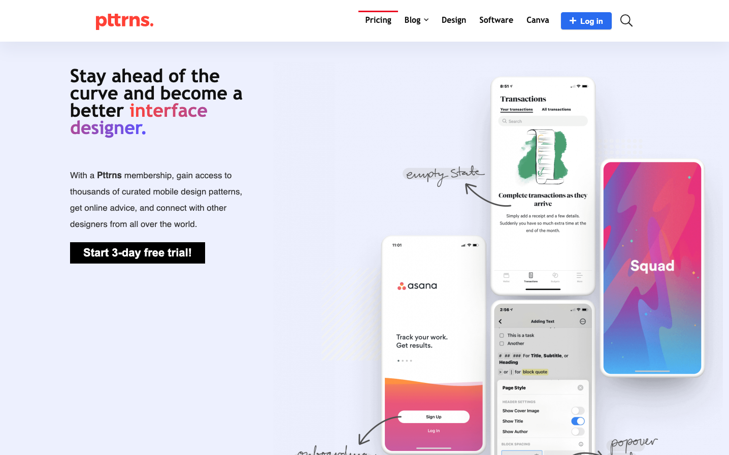
DesignPttrns embraces a bold, education-forward design aesthetic that feels like a premium design course meets mobile app showcase. The typography creates a confident learning hierarchy with mixed typefaces, while the vibrant red signature color projects creative energy and passion for design craft.
Design Identity
Signature Color
Pttrns Crimson
#ea0020
creative passion and design authority - signals expertise and bold confidence in the design education space
Visual Identity
The distinctive mix of Open Sans heavy weights for headlines with Source Sans Pro body text creates an unmistakable educational authority voice, paired with mobile UI mockups that feel like curated gallery pieces floating in generous whitespace.
Component Style
Clean rectangular buttons with subtle rounded corners and moderate padding. The primary CTA uses a confident blue (#296bef) with white text and appears substantial but not overwhelming. Components feel educational-friendly rather than corporate - approachable but authoritative.
Spacing Philosophy
Generous breathing room around mobile mockups creates a gallery-like presentation, with moderate text spacing that prioritizes readability for educational content. The layout feels curated rather than dense, like a design museum.
Design Principles
- Headlines use Open Sans 600 weight for educational authority
- Body text maintains 20px size with 28px line height for readability
- Red accent color (#ea0020) used sparingly for brand moments
- Mobile mockups get premium spacing treatment as hero elements
- Mixed typography families create intentional design course aesthetic
Target Audience
Mobile app designers and UI/UX professionals seeking pattern inspiration and educational resources to advance their interface design skills
Mood
Design descriptions are AI-generated based on visual analysis and may not fully reflect the brand's official design guidelines.
Design System
Typography Scale
| Element | Font | Size | Weight | Line Height |
|---|---|---|---|---|
| body | 15px | 400 | normal | |
| h1 | 36px | 600 | 34px | |
| h2 | 48.3px | 600 | 30px | |
| h3 | 22px | 600 | 20px | |
| p | 20px | 400 | 28px | |
| a | 15px | 400 | 0px | |
| button | 13.3333px | 400 | normal | |
| input | 15px | 400 | 18px | |
| nav | 15px | 400 | normal | |
| header | 15px | 400 | normal |
Color Palette
#000000#abb8c3#ffffff#f78da7#cf2e2e#ff6900#fcb900#7bdcb5#00d084#8ed1fc#0693e3#9b51e0