Help us build this. Leave comments, suggest improvements, and help create better design documentation for agents.
Qonto
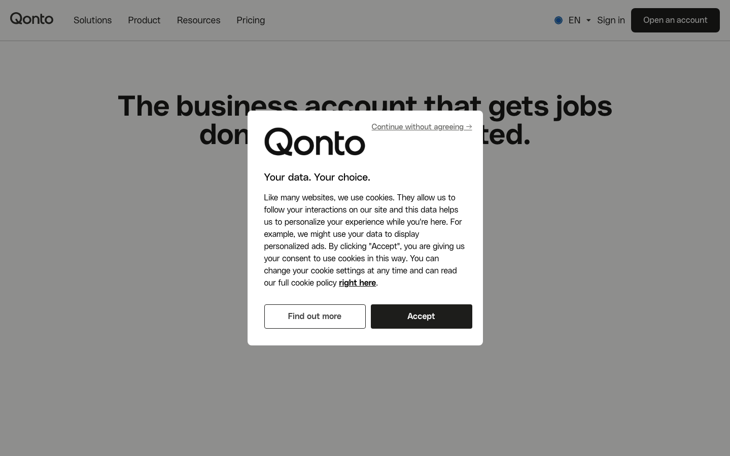
NeobankQonto projects confident European fintech sophistication through its custom QontoSans typeface and deliberate use of abundant whitespace. The brand creates a sense of premium banking trust with clean geometric forms and a muted color palette that feels both professional and approachable.
Design Identity
Signature Color
Qonto Charcoal
#050505
Financial authority and trustworthy precision - the deep charcoal conveys serious business banking without feeling intimidating
Visual Identity
Extreme typographic confidence with oversized headlines and generous whitespace ratios - the brand uses space as a luxury element, with massive text hierarchy jumps that create instant visual authority.
Component Style
Solid, confident buttons with subtle rounded corners and strong weight contrast. The 'Accept' button uses deep charcoal backgrounds with white text, while secondary actions remain outlined. Everything feels substantial but not heavy - purposeful weight without bulk.
Spacing Philosophy
Luxurious breathing room with massive gaps between sections creates a sense of premium positioning. The brand treats whitespace as a design element itself, using generous padding around text blocks and buttons to convey confidence and clarity.
Design Principles
- Typography hierarchy uses dramatic scale jumps: 56px headlines, 18px body, creating instant visual authority
- Custom QontoSans font for headings, PolySans for body - dual font system adds sophistication
- Buttons use 16px PolySans with 700 weight for strong call-to-action presence
- Color palette stays muted with charcoal, white, and subtle accent blues - never garish
- Rounded corners stay subtle - enough to soften but not enough to feel playful
Target Audience
European SME owners and finance managers who value understated premium banking solutions over flashy consumer fintech
Mood
Design descriptions are AI-generated based on visual analysis and may not fully reflect the brand's official design guidelines.
Design System
Typography Scale
| Element | Font | Size | Weight | Line Height |
|---|---|---|---|---|
| body | 18px | 400 | 24px | |
| h1 | 56px | 700 | 56px | |
| h2 | 35px | 600 | 46px | |
| h3 | 24px | 600 | 32px | |
| p | 16px | 300 | 24px | |
| a | 16px | 700 | 24px | |
| button | 16px | 700 | 30px | |
| input | 18px | 400 | 24px | |
| nav | 18px | 400 | 24px | |
| header | 18px | 400 | 24px |
Color Palette
#007aff#c24b89#ea9301#ffffff#0088cc#083778#c6e6fb#7b4db8#050505#654d35#2f95a0#eef0f5