Help us build this. Leave comments, suggest improvements, and help create better design documentation for agents.
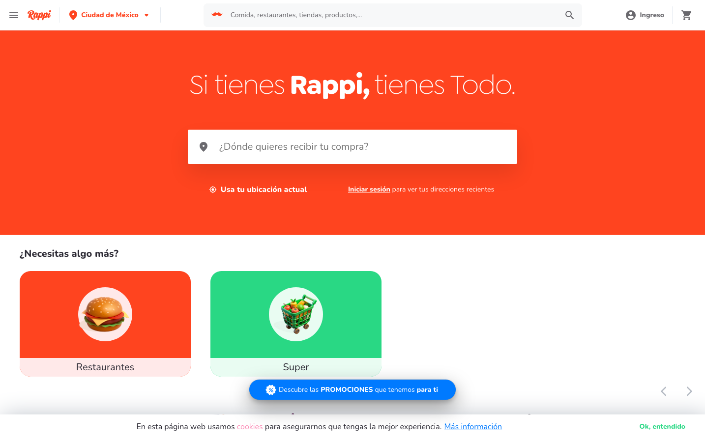
Rappi
Super AppRappi's brand radiates energetic optimism through a bold coral-red foundation that pulses with Latin American warmth and urgency. The chunky Nunito typography creates a friendly, approachable personality that balances professional service delivery with neighborhood familiarity.
Design Identity
Signature Color
Rappi Coral
#FF5722
Energetic immediacy and Latin warmth - signals fast, reliable service with human touch
Visual Identity
The massive coral-red hero section with oversized white typography creates an unmistakable 'color-first' approach - the brand leads with emotion before function.
Component Style
Soft, approachable components with generous rounded corners and subtle shadows. Cards have gentle elevation, buttons feel pillowy rather than sharp, and everything maintains a friendly, touchable quality that prioritizes comfort over precision.
Spacing Philosophy
Breathing room philosophy - massive hero sections create impact, while consistent medium padding (16-24px) keeps interactive elements comfortable without feeling cramped. The layout prioritizes emotional space over information density.
Design Principles
- Color dominates composition - hero sections use 60%+ brand color coverage
- Nunito font family across all elements for consistent warmth
- Rounded corners on all interactive elements (8-12px minimum)
- White text on coral background for maximum contrast and energy
- Icon-driven navigation with friendly illustrations over stark symbols
Target Audience
Urban Latin American millennials who value convenience and human connection - people who want technology that feels like a helpful neighbor rather than a cold corporation
Mood
Design descriptions are AI-generated based on visual analysis and may not fully reflect the brand's official design guidelines.
Design System
Typography Scale
| Element | Font | Size | Weight | Line Height |
|---|---|---|---|---|
| body | 16px | 400 | 24px | |
| h2 | 20px | 400 | 34px | |
| h3 | 16px | 400 | 26px | |
| p | 20px | 800 | 30px | |
| a | 16px | 400 | 24px | |
| button | 16px | 400 | 24px | |
| input | 14px | 400 | 23.94px | |
| footer | 16px | 400 | 24px |
Color Palette
#086f83#005e93#00a3c4#68d391#9b2c2c#2a4365#c5e4f3#7b341e#234e52#d53f8c#fff2e5#4267b2