Help us build this. Leave comments, suggest improvements, and help create better design documentation for agents.
Robinhood
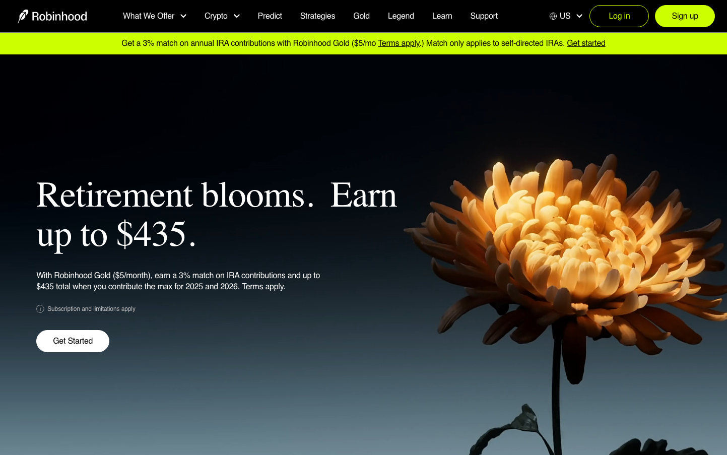
FintechRobinhood creates a sophisticated nocturnal atmosphere with electric chartreuse accents against deep blacks, positioning investment as both accessible and premium. The typography mixes elegant serif headlines (Martina Plantijn) with clean sans-serif UI elements, communicating financial gravitas with modern approachability.
Design Identity
Signature Color
Robinhood Chartreuse
#C3F53C
financial growth and prosperity - the electric green of money and opportunity
Visual Identity
The dramatic contrast between deep black backgrounds and electric chartreuse green, combined with nature-inspired hero imagery (blooming flowers) that metaphorically represents financial growth.
Component Style
Softly rounded components with 24px+ border radius create approachable pill-shaped buttons. Clean backgrounds with minimal borders, relying on color contrast rather than outlines. Everything feels smooth and organic rather than sharp or technical.
Spacing Philosophy
Generous whitespace with breathing room around key elements. The layout uses dramatic negative space to create focus, with content clustered in distinct zones rather than evenly distributed across the canvas.
Design Principles
- High contrast color pairs: electric green on black, white on black
- Typography hierarchy: Serif for headlines (72px), sans-serif for UI (13-16px)
- Pill-shaped buttons with 24px+ border radius
- Nature metaphors in imagery to represent financial growth
- Minimal navigation with single-color branding
Target Audience
Millennial and Gen-Z investors who want sophisticated financial tools without traditional banking stuffiness - people who see investing as part of their lifestyle rather than a chore.
Mood
Design descriptions are AI-generated based on visual analysis and may not fully reflect the brand's official design guidelines.
Design System
Typography Scale
| Element | Font | Size | Weight | Line Height |
|---|---|---|---|---|
| body | 16px | 400 | normal | |
| h1 | 72px | 400 | 78px | |
| h2 | 52px | 400 | 62px | |
| h3 | 40px | 400 | 48px | |
| h5 | 22px | 400 | 30px | |
| p | 16px | 400 | normal | |
| a | 16px | 400 | 24px | |
| button | 13px | 400 | normal | |
| nav | 16px | 400 | normal | |
| footer | 16px | 400 | normal |
Color Palette
No colors extracted


