Help us build this. Leave comments, suggest improvements, and help create better design documentation for agents.
Rossum
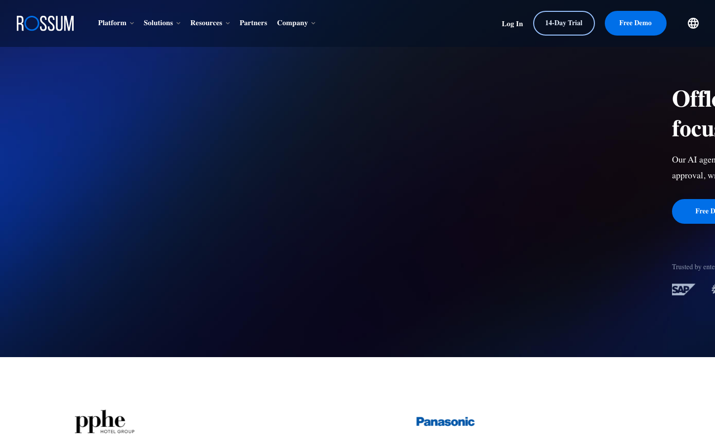
AIRossum projects deep midnight sophistication with its rich navy-to-black gradient backdrop that feels like premium financial software. The electric blue accent creates striking contrast against the darkness, while generous whitespace and clean typography suggest enterprise-grade precision for document automation.
Design Identity
Signature Color
Electric Process Blue
#0693e3
AI-powered automation trust - the electric spark of intelligent document processing
Visual Identity
The dramatic dark gradient hero with precise white text floating in digital space - it feels like looking into an AI's processing environment where documents become data.
Component Style
Clean rounded buttons with generous padding and subtle gradients. The primary CTA uses vibrant blue with soft corners (8-12px radius) while maintaining crisp white text. No harsh shadows - everything feels digitally native and weightless.
Spacing Philosophy
Luxurious breathing room with large section gaps (80px+) creating a sense of enterprise sophistication. Tight internal component spacing maintains focus while the expansive hero area suggests powerful underlying technology.
Design Principles
- Dark gradients always flow from deep blue to near-black for technological depth
- Electric blue (#0693e3) is the only vibrant accent against neutral grays
- Button radius stays consistent at 8-12px - never fully rounded pills
- White text maintains stark contrast against dark backgrounds
- Inter font weight never goes below 400, typically 500-600 for authority
Target Audience
Enterprise finance and operations teams who need AI document processing - CFOs and process automation managers who value sophisticated technology over flashy marketing
Mood
Design descriptions are AI-generated based on visual analysis and may not fully reflect the brand's official design guidelines.
Design System
Typography Scale
| Element | Font | Size | Weight | Line Height |
|---|---|---|---|---|
| body | 17px | 500 | 23.8px | |
| h1 | 17px | 600 | 17px | |
| h2 | 36px | 600 | 44px | |
| h3 | 24px | 600 | 32px | |
| p | 17px | 500 | 23.8px | |
| a | 17px | 500 | 23.8px | |
| button | 17px | 400 | 24px | |
| nav | 17px | 500 | 23.8px | |
| header | 17px | 500 | 23.8px | |
| footer | 17px | 500 | 23.8px |
Color Palette
#000000#abb8c3#ffffff#f78da7#cf2e2e#ff6900#fcb900#7bdcb5#00d084#8ed1fc#0693e3#9b51e0