Help us build this. Leave comments, suggest improvements, and help create better design documentation for agents.
Sanity
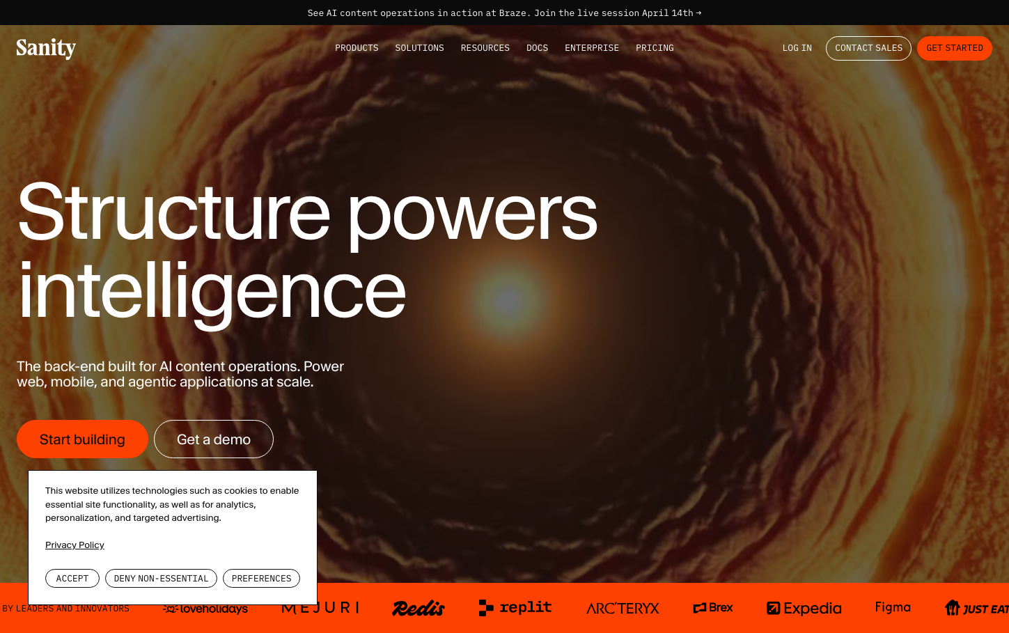
Dev ToolsSanity's brand radiates cosmic intelligence through a warm orange-to-burgundy gradient that suggests both sunset and neural networks. The massive 112px heading creates gravitational pull while the proprietary 'waldenburgNormal' typeface feels deliberately crafted yet approachable, communicating structured creativity.
Design Identity
Signature Color
Sanity Coral
#f36458
Creative energy and human-centered AI - warm intelligence that's approachable yet powerful
Visual Identity
The swirling cosmic tunnel background creates a signature 'portal' effect that suggests diving deep into structured content, making any interface instantly recognizable as a platform for exploring and organizing complex information.
Component Style
Buttons use monospace IBM Plex Mono with minimal 3px border radius, creating a developer-friendly aesthetic. The coral primary button feels warm and inviting while maintaining technical precision through restrained typography and subtle shadows.
Spacing Philosophy
Generous whitespace on the left creates breathing room for the massive headline, while the cosmic background fills negative space with purpose. The layout suggests infinite depth while keeping content grounded and accessible.
Design Principles
- Border radius never exceeds 3px for components
- Typography scales dramatically: 112px headlines to 13px buttons
- Buttons always use monospace fonts for technical precision
- Backgrounds use gradient depth to suggest data exploration
- Shadows are subtle: maximum 15px blur with low opacity
Target Audience
Technical content creators and developers who need powerful content infrastructure but value human-centered design over purely utilitarian interfaces
Mood
Design descriptions are AI-generated based on visual analysis and may not fully reflect the brand's official design guidelines.
Design System
Typography Scale
| Element | Font | Size | Weight | Line Height |
|---|---|---|---|---|
| body | 16px | 400 | 24px | |
| h1 | 112px | 400 | 112px | |
| h2 | 72px | 400 | 75.6px | |
| h3 | 48px | 400 | 51.84px | |
| p | 20px | 400 | 22px | |
| a | 13px | 400 | 19.5px | |
| button | 13px | 400 | 19.5px | |
| input | 15px | 400 | 22.5px | |
| nav | 16px | 400 | 24px | |
| header | 16px | 400 | 24px |
Color Palette
#ffffff#f36458#121923#afbaca#f68b82#3c4758#206ee9#37cd8f#29246a#df5044#37cd84#058a5e