Help us build this. Leave comments, suggest improvements, and help create better design documentation for agents.
Scalable Capital
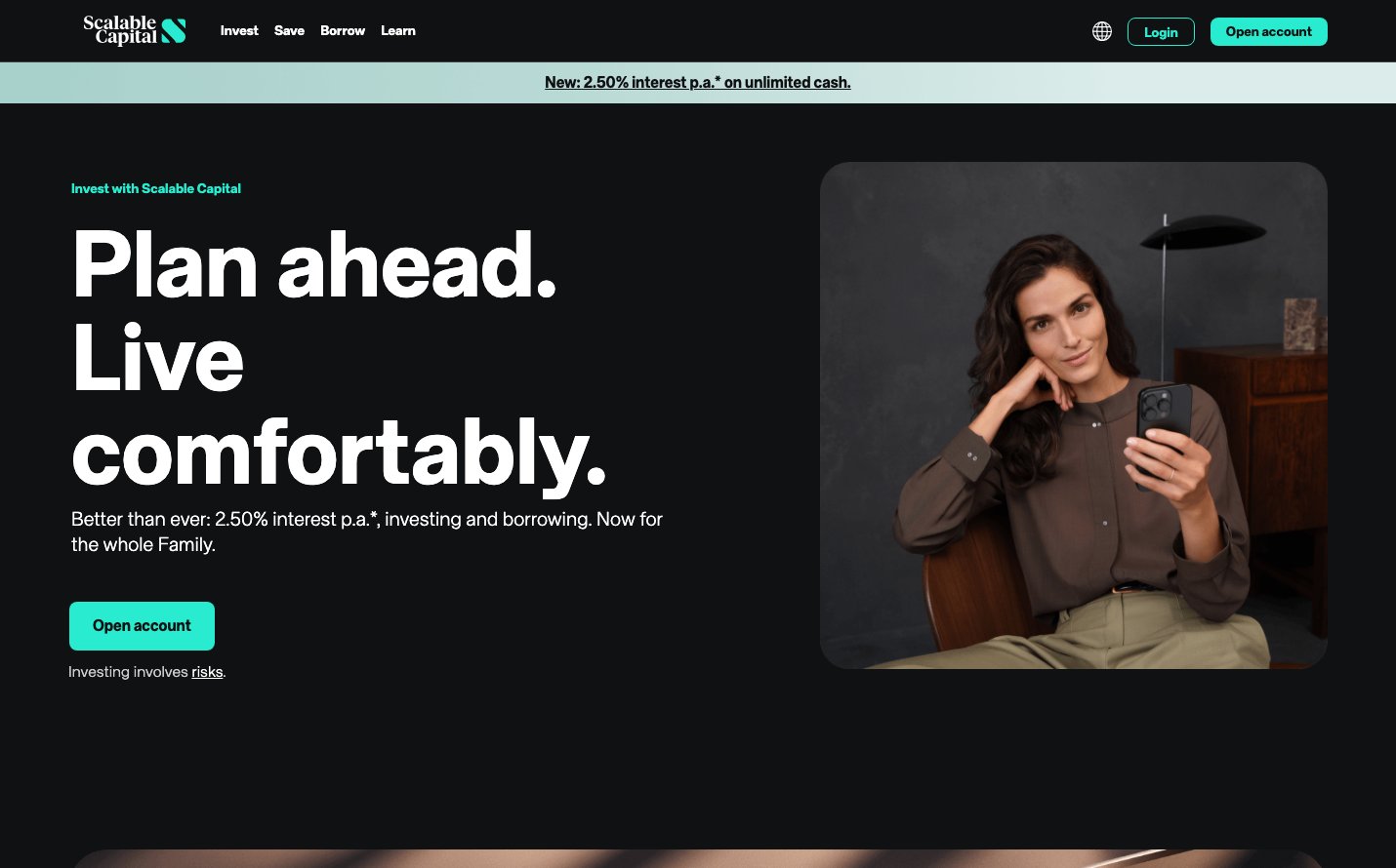
FintechScalable Capital embodies premium fintech minimalism through its striking teal signature color and dramatic dark aesthetic. The brand balances massive 96px hero typography with intimate lifestyle photography, creating a confident yet approachable investment platform that feels both aspirational and accessible.
Design Identity
Signature Color
Scalable Teal
#00B5A5
Premium fintech trust with a modern edge - sophisticated enough for serious investors yet refreshing against traditional banking blues
Visual Identity
The dramatic contrast between massive white typography on dark backgrounds paired with warm, intimate lifestyle photography creates an unmistakable premium fintech aesthetic that balances ambition with comfort.
Component Style
Buttons feature generous rounded corners (approximately 8px) with the signature teal fill and clean white text. No shadows or borders - components rely on solid color fills and ample padding for impact. Everything feels substantial yet approachable.
Spacing Philosophy
Luxurious whitespace with dramatic asymmetrical layouts - large blocks of negative space on the left balance dense content areas, while generous padding around buttons (16px vertical, 32px horizontal) creates premium touchpoints.
Design Principles
- Typography scales dramatically: 96px headlines to 16px body text
- Teal accent color is used sparingly for maximum impact
- Dark backgrounds (near-black) provide premium context
- Button radius stays consistent at 8px across all components
- Photography always shows real people in comfortable, aspirational settings
Target Audience
Affluent millennials and Gen-X professionals who want sophisticated investment tools without traditional banking stuffiness - people who value both financial growth and life balance
Mood
Design descriptions are AI-generated based on visual analysis and may not fully reflect the brand's official design guidelines.
Design System
Typography Scale
| Element | Font | Size | Weight | Line Height |
|---|---|---|---|---|
| body | 16px | 300 | 22.4px | |
| h1 | 40px | 700 | 48px | |
| h2 | 96px | 700 | 96px | |
| h3 | 96px | 700 | 96px | |
| h4 | 20px | 700 | 24px | |
| p | 16px | 700 | 22.4px | |
| a | 16px | 300 | 22.4px | |
| button | 16px | 400 | 22.4px | |
| input | 16px | 400 | 22.4px |
Color Palette
#dee2e6#000000#dc3545#d63384#212529#ced4da#e9ecef#198754#ffffff#f8f9fa#0d6efd