Help us build this. Leave comments, suggest improvements, and help create better design documentation for agents.
Scalapay
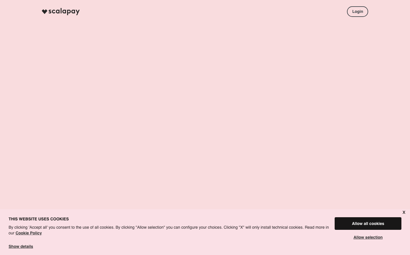
FintechScalapay embraces a romantic, dreamy aesthetic with its signature blush pink background that feels like cotton candy or a sunset glow. The typography hierarchy mixes the dramatic 'Ohno Fatface' display font with clean Poppins and sophisticated Degular, creating a playful yet trustworthy fintech personality that softens traditional payment experiences.
Design Identity
Signature Color
Scalapay Blush
#f8d7da
approachable fintech warmth - making payments feel gentle and human rather than cold and transactional
Visual Identity
The dreamy blush pink background creates an unmistakable romantic atmosphere that no other fintech brand dares to use - it's instantly recognizable as the 'soft payment company'
Component Style
Minimalist and weightless - components float on the pink canvas with subtle rounded corners and likely minimal shadows, prioritizing softness over sharp corporate edges
Spacing Philosophy
Generous breathing room with expansive whitespace that lets the pink background dominate, creating an airy, uncluttered feel that reduces payment anxiety
Design Principles
- Typography contrast: Dramatic 72px Ohno Fatface headlines against 14px Poppins body text
- Weight consistency: Bold 700 weight across headings and body text for strong hierarchy
- Pink-first design: Every interface element designed to work harmoniously with blush backgrounds
- Rounded softness: No sharp corners - everything has subtle radius to maintain gentle feel
Target Audience
Millennial and Gen-Z consumers, particularly women, who want their financial tools to feel as beautiful and approachable as lifestyle brands they love
Mood
Design descriptions are AI-generated based on visual analysis and may not fully reflect the brand's official design guidelines.
Design System
Typography Scale
| Element | Font | Size | Weight | Line Height |
|---|---|---|---|---|
| body | 14px | 500 | 20px | |
| h1 | 72px | 700 | 81px | |
| h2 | 48px | 600 | 48px | |
| h3 | 48px | 700 | 48px | |
| h5 | 20px | 700 | 26px | |
| p | 14px | 700 | 19.6px | |
| a | 14px | 700 | 19.6px | |
| input | 12px | 500 | normal | |
| nav | 14px | 500 | 20px |
Color Palette
#fafafa