Help us build this. Leave comments, suggest improvements, and help create better design documentation for agents.
Scandit
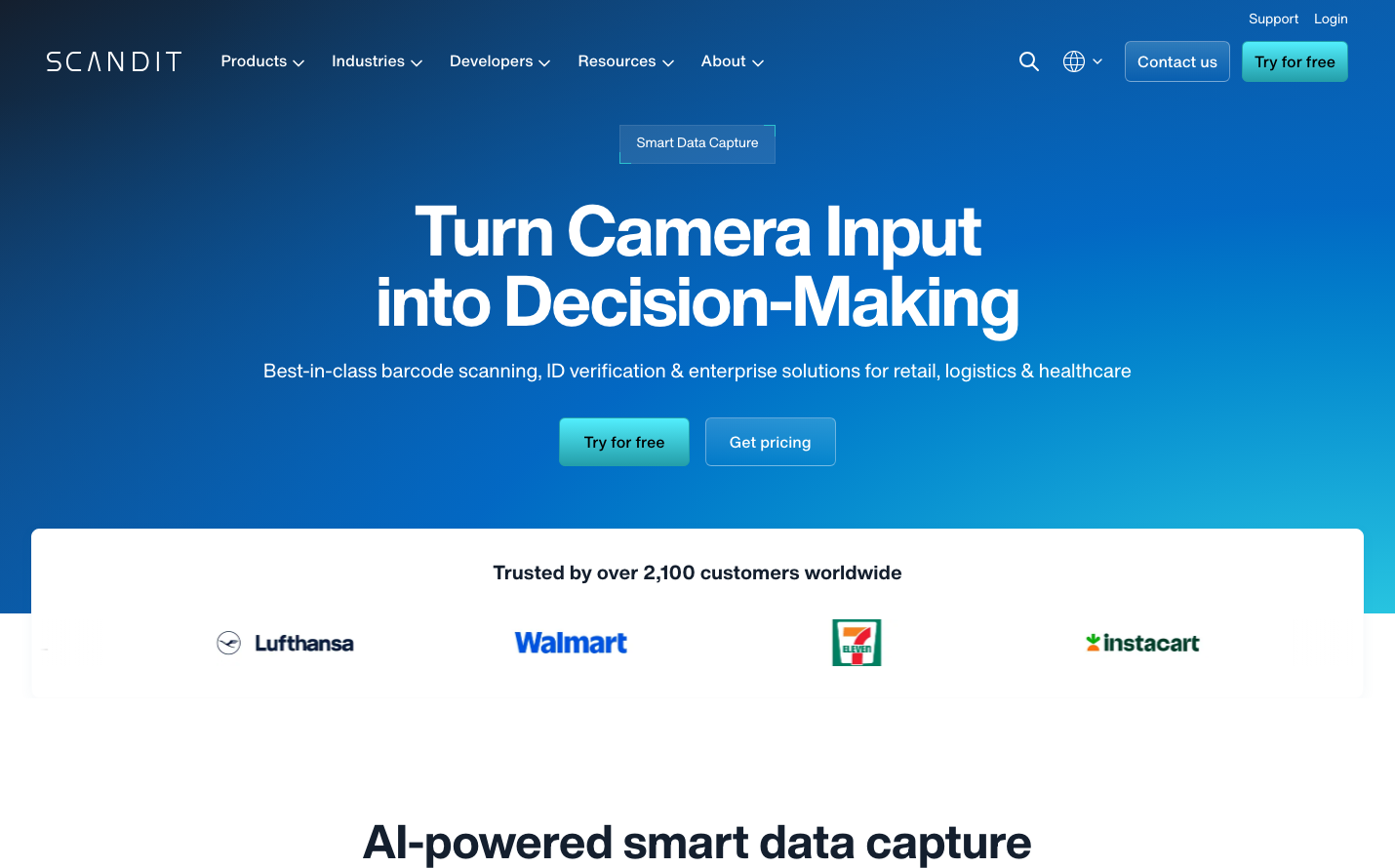
Computer VisionScandit embodies enterprise confidence through a deep ocean-blue gradient that commands trust and authority. The typography feels deliberate and corporate-precise, with bold headlines that communicate reliability without flash.
Design Identity
Signature Color
Enterprise Ocean
#2563EB
B2B trust and technical reliability - the color of mission-critical software
Visual Identity
The immersive blue gradient backdrop with stark white content overlay creates a distinctive 'portal' effect - like looking through a window into enterprise solutions.
Component Style
Moderate rounded corners (6-8px) with clean fills and subtle transparency. Buttons feel substantial with medium weight, avoiding both sharp corporate edges and overly friendly curves. No heavy shadows - relies on color contrast and solid fills.
Spacing Philosophy
Hero section dominates with generous vertical breathing room, while content clusters tightly within the white overlay section. Creates a sense of focused importance rather than scattered information.
Design Principles
- Blue gradient always anchors the hero section
- White content overlays break up monochromatic backgrounds
- Typography weight jumps dramatically: 400 for body, 700 for headlines
- Customer logos displayed as simple, clean lockups in grid format
- Buttons maintain 16px font size with 500 weight consistency
Target Audience
Enterprise technology decision-makers who need proven, scalable solutions for mission-critical operations
Mood
Design descriptions are AI-generated based on visual analysis and may not fully reflect the brand's official design guidelines.
Design System
Typography Scale
| Element | Font | Size | Weight | Line Height |
|---|---|---|---|---|
| body | 16px | 400 | 25.6px | |
| h1 | 72px | 700 | 72px | |
| h2 | 48px | 700 | 48px | |
| h3 | 20px | 500 | 28px | |
| p | 16px | 400 | 25.6px | |
| a | 14px | 400 | 14px | |
| button | 16px | 500 | 25.6px | |
| nav | 16px | 400 | 25.6px | |
| header | 16px | 400 | 25.6px | |
| footer | 16px | 400 | 25.6px |
Color Palette
#ffffff#000000

