Help us build this. Leave comments, suggest improvements, and help create better design documentation for agents.
Settle
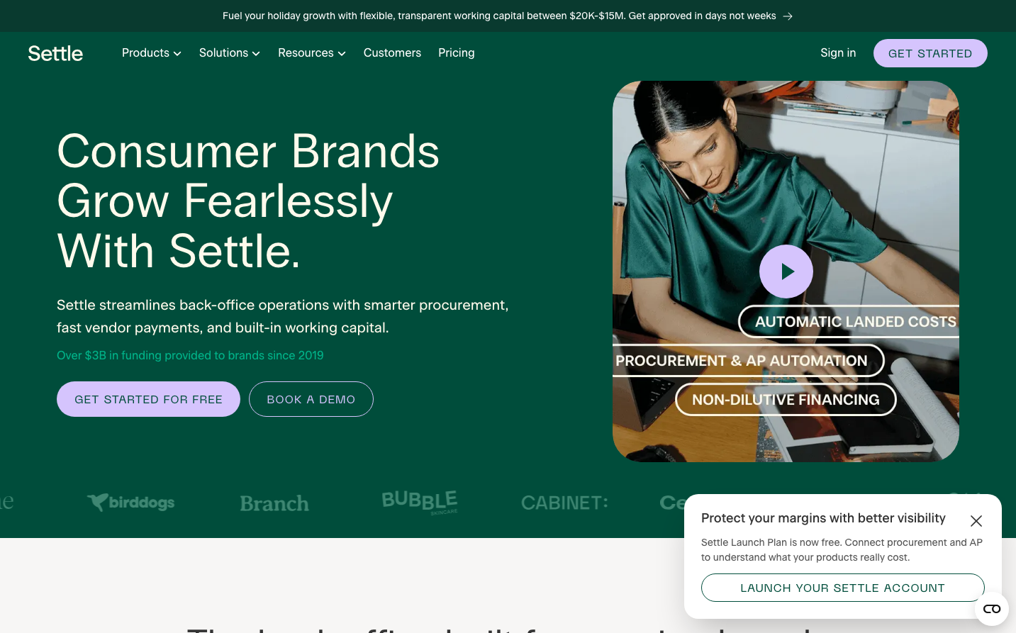
FintechSettle's brand exudes fintech sophistication through a rich emerald green that conveys growth and financial prosperity. The typography mixing Radio Grotesk's geometric headlines with Beausite Classic's approachable body text creates a balance between financial authority and human warmth, while the hero video overlay with floating feature badges suggests dynamic, real-time financial operations.
Design Identity
Signature Color
Settle Emerald
#2D6A4F
Financial growth and prosperity - evoking the stability of established wealth while suggesting the dynamism of scaling businesses
Visual Identity
Floating, semi-transparent feature badges overlaying real-world business imagery - creating a tech-forward overlay on authentic business moments that suggests seamless integration of financial tools into daily operations.
Component Style
Generous pill-shaped buttons with 24px+ border radius and substantial padding create approachable, finger-friendly interactions. Cards feature subtle transparency and floating layouts rather than heavy shadows, suggesting lightness and flexibility in financial operations.
Spacing Philosophy
Expansive hero sections with 80px+ vertical spacing create breathing room that suggests financial abundance, while tight component clustering keeps related features visually connected - mirroring how financial operations need both strategic overview and tactical precision.
Design Principles
- Border radius consistently uses pill shapes (24px+) for primary actions
- Typography hierarchy uses 3 distinct font families: Radio Grotesk for headlines, Beausite Classic for body, Neue Machina for emphasis
- Green dominates 70% of the color palette with white text for maximum contrast
- Feature callouts use floating badges rather than traditional cards
- Video/imagery always shows real people in authentic business environments
Target Audience
Series A to C consumer brand founders and CFOs who need sophisticated financial infrastructure but want approachable, transparent tools - not intimidating enterprise banking interfaces.
Mood
Design descriptions are AI-generated based on visual analysis and may not fully reflect the brand's official design guidelines.
Design System
Typography Scale
| Element | Font | Size | Weight | Line Height |
|---|---|---|---|---|
| body | 16px | 400 | 24px | |
| h1 | 68px | 400 | 70.72px | |
| h2 | 51px | 400 | 56.1px | |
| h3 | 38px | 400 | 39.9px | |
| h4 | 44px | 700 | 50.6px | |
| h5 | 18px | 500 | 21.6px | |
| h6 | 16px | 400 | 24px | |
| p | 20px | 500 | 32px | |
| a | 16px | 400 | 24px | |
| button | 16px | 400 | 24px |
Color Palette
#ffffff#000000