Help us build this. Leave comments, suggest improvements, and help create better design documentation for agents.
Spark
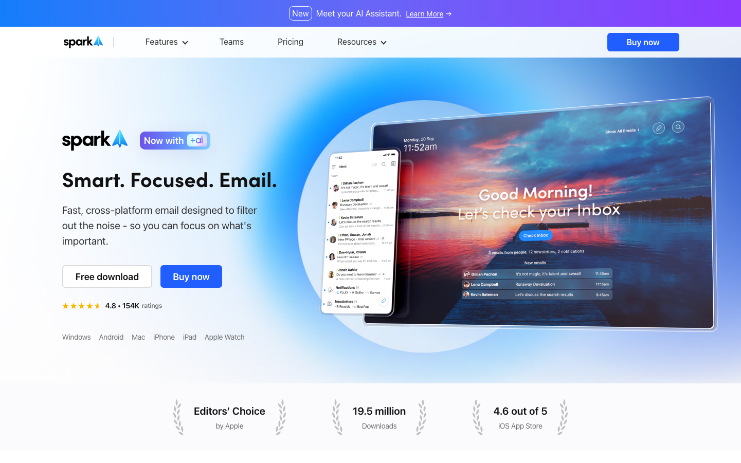
CommunicationSpark embraces a vibrant gradient aesthetic that transitions from electric blue to deep purple, creating an energetic yet professional atmosphere. The brand combines bold Sofia-Pro typography with clean system fonts, establishing a confident voice that balances innovation with accessibility.
Design Identity
Signature Color
Spark Electric Blue
#006ee5
Digital innovation and trustworthy efficiency - the reliable backbone of smart communication
Visual Identity
The distinctive blue-to-purple gradient backgrounds paired with floating device mockups create an immediately recognizable spatial depth that feels both futuristic and approachable.
Component Style
Buttons feature generous rounded corners (approximately 8px) with solid fills and no visible borders or shadows, creating a soft, approachable feel that contrasts with the bold gradient backgrounds.
Spacing Philosophy
Asymmetrical layout with generous whitespace on the left for content hierarchy, while the right side showcases large product visuals - creating a 60/40 visual weight distribution that guides the eye naturally.
Design Principles
- Headlines use Sofia-Pro at 800 weight for maximum impact
- Gradients always flow from blue (#006ee5 family) to purple tones
- Product mockups float at angles to suggest movement and innovation
- System fonts for body text ensure maximum readability across platforms
- Focus states use soft blue glow (rgba(131, 192, 253, 0.50))
Target Audience
Productivity-focused professionals who want powerful email management without sacrificing design elegance - people who appreciate both Apple's design philosophy and cross-platform functionality
Mood
Design descriptions are AI-generated based on visual analysis and may not fully reflect the brand's official design guidelines.
Design System
Typography Scale
| Element | Font | Size | Weight | Line Height |
|---|---|---|---|---|
| body | 16px | 400 | normal | |
| h1 | 40px | 800 | 53.2px | |
| h2 | 48px | 800 | 63.84px | |
| h3 | 32px | 800 | 42.56px | |
| p | 16px | 400 | 24px | |
| a | 16px | 400 | normal | |
| button | 0px | 400 | 0px | |
| nav | 16px | 600 | normal | |
| header | 16px | 400 | normal | |
| footer | 16px | 400 | normal |
Color Palette
#ffffff#111111#333333#1c1c1c#006ee5#6e6e6e