Help us build this. Leave comments, suggest improvements, and help create better design documentation for agents.
Spinny
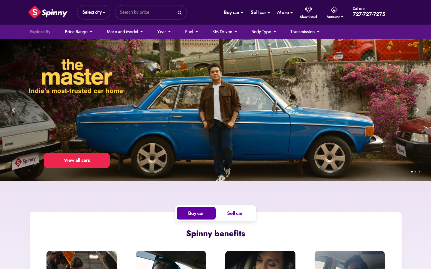
AutomotiveSpinny creates a premium automotive marketplace aesthetic through deep purple navigation contrasted with warm, cinematic photography. The brand balances digital sophistication with authentic storytelling, using bold golden typography ('the master') against rich purple backgrounds to convey trust and automotive expertise.
Design Identity
Signature Color
Spinny Deep Purple
#4A1A5C
automotive luxury and digital trust - premium car marketplace authority
Visual Identity
Rich purple navigation bars with golden yellow accent typography, combined with authentic lifestyle automotive photography featuring real people with vintage cars in natural settings
Component Style
Rounded pill buttons with generous padding and bold contrast. The primary CTA uses bright coral-pink with white text and substantial border radius (~24px). Navigation elements have subtle transparency over the purple base, creating depth without harsh edges.
Spacing Philosophy
Generous vertical breathing room between sections with tight, purposeful spacing within components. The hero section uses full-bleed photography with strategically placed text overlays, while navigation maintains compact 40-50px height for efficiency.
Design Principles
- Purple dominates navigation and structural elements
- Golden yellow reserved for key messaging and brand statements
- Border radius consistently 20px+ for friendly approachability
- Typography mixing custom font families with Times for links
- Photography always lifestyle-focused with authentic human subjects
Target Audience
Urban car buyers and sellers aged 25-40 who value both digital convenience and authentic automotive experiences, seeking premium marketplace trust
Mood
Design descriptions are AI-generated based on visual analysis and may not fully reflect the brand's official design guidelines.
Design System
Typography Scale
| Element | Font | Size | Weight | Line Height |
|---|---|---|---|---|
| body | 16px | 400 | 16px | |
| h2 | 28px | 400 | 34px | |
| h3 | 18px | 400 | 24px | |
| h4 | 18px | 400 | 24px | |
| p | 16px | 400 | 22px | |
| a | 16px | 400 | 16px | |
| button | 18px | 400 | 18px | |
| input | 16px | 400 | 24px | |
| footer | 16px | 400 | 16px |
Color Palette
No colors extracted