Help us build this. Leave comments, suggest improvements, and help create better design documentation for agents.
Ssense
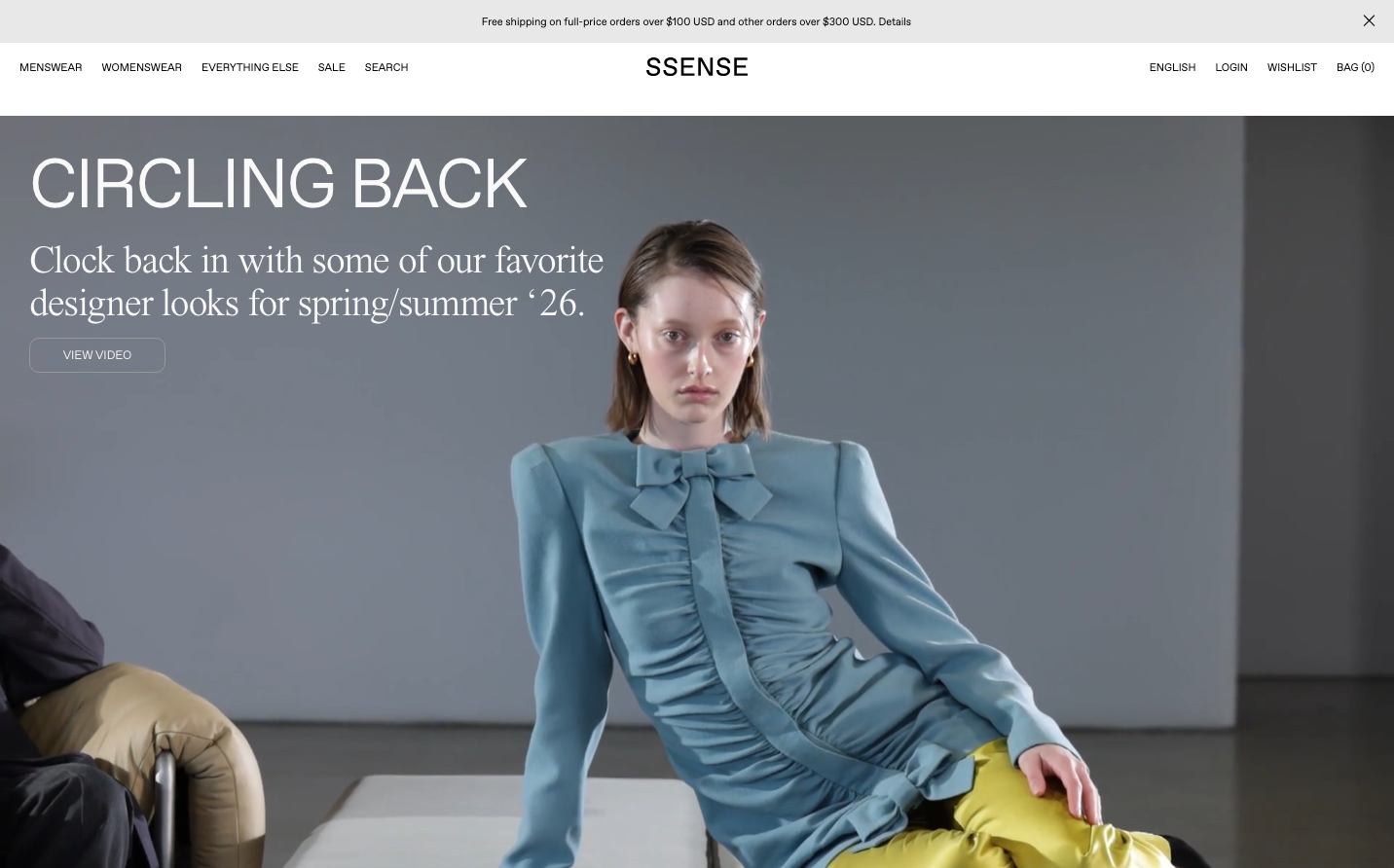
FashionSsense embodies high-fashion minimalism through stark monochromatic compositions and editorial typography hierarchy. The brand uses museum-like whitespace and fashion photography to create an atmosphere of avant-garde luxury that feels more like a contemporary art gallery than a traditional e-commerce site.
Design Identity
Signature Color
Gallery White
#FFFFFF
editorial minimalism and high-fashion exclusivity
Visual Identity
Extreme compositional restraint with vast negative space, editorial fashion photography as the primary visual language, and microscopic typography that forces intimate engagement - like reading the credits of a high-fashion magazine.
Component Style
Invisible UI with hairline borders and ghost-weight typography. Buttons and links are whisper-thin at 11px with 500 weight, creating an anti-commercial aesthetic that prioritizes editorial purity over conversion optimization.
Spacing Philosophy
Museum-gallery spacing with massive negative space surrounding minimal content islands. Typography is compressed to microscopic sizes while imagery breathes in cathedral-like expanses, creating intimate vs. monumental tension.
Design Principles
- All interactive text uses 11px Favorit SSENSE Inter at 400-500 weight maximum
- Headings contrast dramatically: 71px for impact, 40px for editorials, 19px for hierarchy
- Body text never exceeds 20px and uses ultra-light 100 weight
- Serif typography (JHA Times Now) reserved for editorial content only
- Whitespace dominates - content occupies less than 30% of viewport
Target Audience
Fashion-forward consumers who view clothing as art curation and prefer brands that signal cultural sophistication over accessibility
Mood
Design descriptions are AI-generated based on visual analysis and may not fully reflect the brand's official design guidelines.
Design System
Typography Scale
| Element | Font | Size | Weight | Line Height |
|---|---|---|---|---|
| body | 11px | 400 | 15px | |
| h1 | 71.25px | 400 | 76px | |
| h2 | 40px | 400 | 44px | |
| h4 | 19px | 400 | 26px | |
| p | 20px | 100 | 26px | |
| a | 11px | 400 | 15px | |
| button | 11px | 500 | 15px | |
| input | 11px | 400 | 12.65px | |
| nav | 11px | 400 | 50px | |
| header | 11px | 400 | 15px |
Color Palette
No colors extracted