Help us build this. Leave comments, suggest improvements, and help create better design documentation for agents.
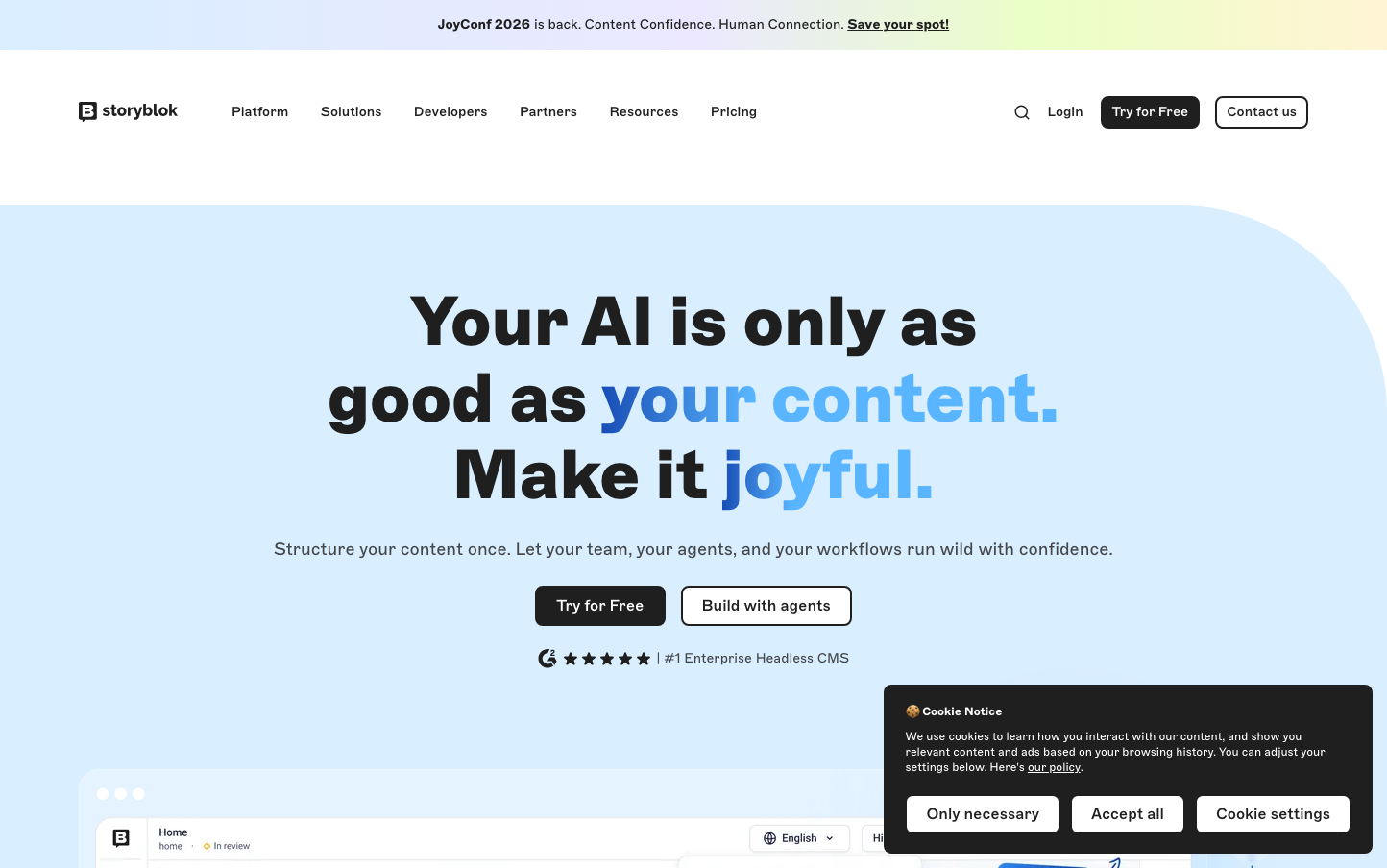
Storyblok
CMSStoryblok embodies confident editorial authority through its bold Marfa typography and distinctive teal-blue palette that feels both technical and approachable. The design balances dramatic scale (72px headlines) with refined restraint, creating a premium content platform aesthetic that whispers expertise rather than shouting features.
Design Identity
Signature Color
Storyblok Teal
#00b3b0
Content management trust - bridging the gap between technical capability and creative flow
Visual Identity
The unmistakable combination of ultra-bold Marfa typography at massive scale with strategic blue accent highlights creates an instantly recognizable editorial-meets-tech aesthetic that feels more like a premium publishing house than a typical SaaS platform.
Component Style
Softly rounded components with 8-10px border radius that feel approachable yet professional. Buttons have substantial 20px horizontal padding with subtle shadows, while the overall treatment favors gentle curves over sharp edges - everything feels crafted rather than constructed.
Spacing Philosophy
Generous breathing room defines the experience - massive headline scales create dramatic hierarchy while ample whitespace around CTAs and sections prevents cognitive overload. The rhythm alternates between expansive hero moments and intimate, focused interaction zones.
Design Principles
- Typography weight jumps dramatically from 400 to 900 - no middle ground
- Border radius stays consistently between 8-24px across all components
- Teal accent color is used sparingly but decisively for key moments
- Shadows are subtle and organic, never harsh or geometric
- Button padding uses 20px minimum horizontal spacing for substantial feel
Target Audience
Content strategists and marketing teams at scale-up companies who need enterprise-grade CMS capabilities but refuse to sacrifice design sensibility for functionality.
Mood
Design descriptions are AI-generated based on visual analysis and may not fully reflect the brand's official design guidelines.
Design System
Typography Scale
| Element | Font | Size | Weight | Line Height |
|---|---|---|---|---|
| body | 16px | 400 | 24px | |
| h1 | 72px | 900 | 80px | |
| h2 | 36px | 900 | 40px | |
| p | 12px | 400 | 16px | |
| a | 12px | 400 | 16px | |
| button | 16px | 500 | 24px | |
| nav | 16px | 400 | 24px | |
| header | 16px | 400 | 24px | |
| footer | 16px | 400 | 24px | |
| main | 16px | 400 | 24px |
Color Palette
#00b3b0#ffffff#f5f5f7#eef8ff#1f1f1f#44474a#184db5#142b57#bce2ff#101010#7f7f7f#396c08