Help us build this. Leave comments, suggest improvements, and help create better design documentation for agents.
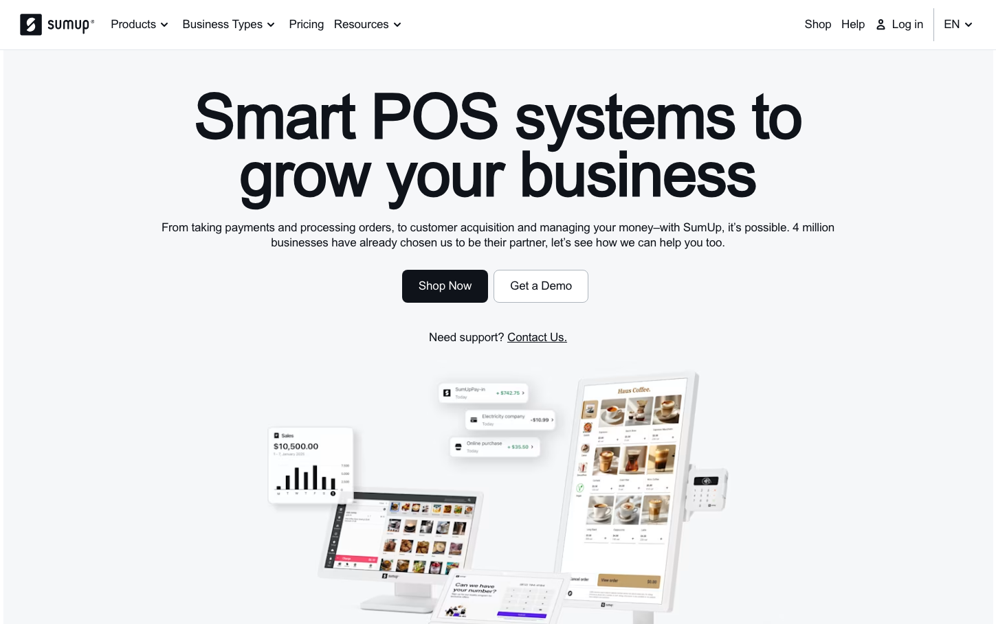
SumUp
FintechSumUp's brand exudes entrepreneurial confidence through bold black-and-white minimalism with sophisticated gray transitions. The Inter typography and generous spacing create a sense of business maturity and reliability, while the stark color palette communicates fintech seriousness without intimidation.
Design Identity
Signature Color
SumUp Midnight
#000000
business authority and financial trust - the unwavering black suggests decisive transactions and professional reliability
Visual Identity
Extremely bold typography hierarchy with massive 84px headlines that dominate the viewport, paired with ultra-clean whitespace and minimal interface elements that feel deliberately understated
Component Style
Softly rounded 8px corners with subtle hover states transitioning through sophisticated grays. Buttons feel substantial but approachable - not harsh geometric shapes but gently curved rectangles that suggest accessibility
Spacing Philosophy
Luxuriously generous vertical rhythm with expansive whitespace that lets the bold typography breathe, creating an executive-level sense of confidence and unhurried decision-making
Design Principles
- Border radius never exceeds 16px, typically staying at 8px for friendly approachability
- Typography uses dramatic scale jumps: 16px body to 84px headlines for maximum impact
- Transitions are quick at 0.12s to feel responsive, not sluggish
- Gray backgrounds use subtle 375 font weight to maintain readability without harshness
- Black backgrounds reserved for strongest emphasis and primary actions
Target Audience
Small to medium business owners who need sophisticated payment solutions but aren't financial experts - entrepreneurs who value simplicity over complexity
Mood
Design descriptions are AI-generated based on visual analysis and may not fully reflect the brand's official design guidelines.
Design System
Typography Scale
| Element | Font | Size | Weight | Line Height |
|---|---|---|---|---|
| body | 16px | 375 | 22px | |
| h1 | 84px | 375 | 84px | |
| h2 | 32px | 630 | 36px | |
| h3 | 18px | 630 | 22px | |
| h5 | 16px | 375 | 22px | |
| p | 16px | 375 | 22px | |
| a | 16px | 375 | 22px | |
| button | 16px | 375 | 22px | |
| nav | 16px | 375 | 22px | |
| header | 16px | 375 | 22px |
Color Palette
#ffffff#e9edf2#bfc6cf#f0f1f5#e0e2ea#9da7b1#e3e7eb#c2c9d1#0f131a#000000#313941#4f5a65