Help us build this. Leave comments, suggest improvements, and help create better design documentation for agents.
Taco Bell
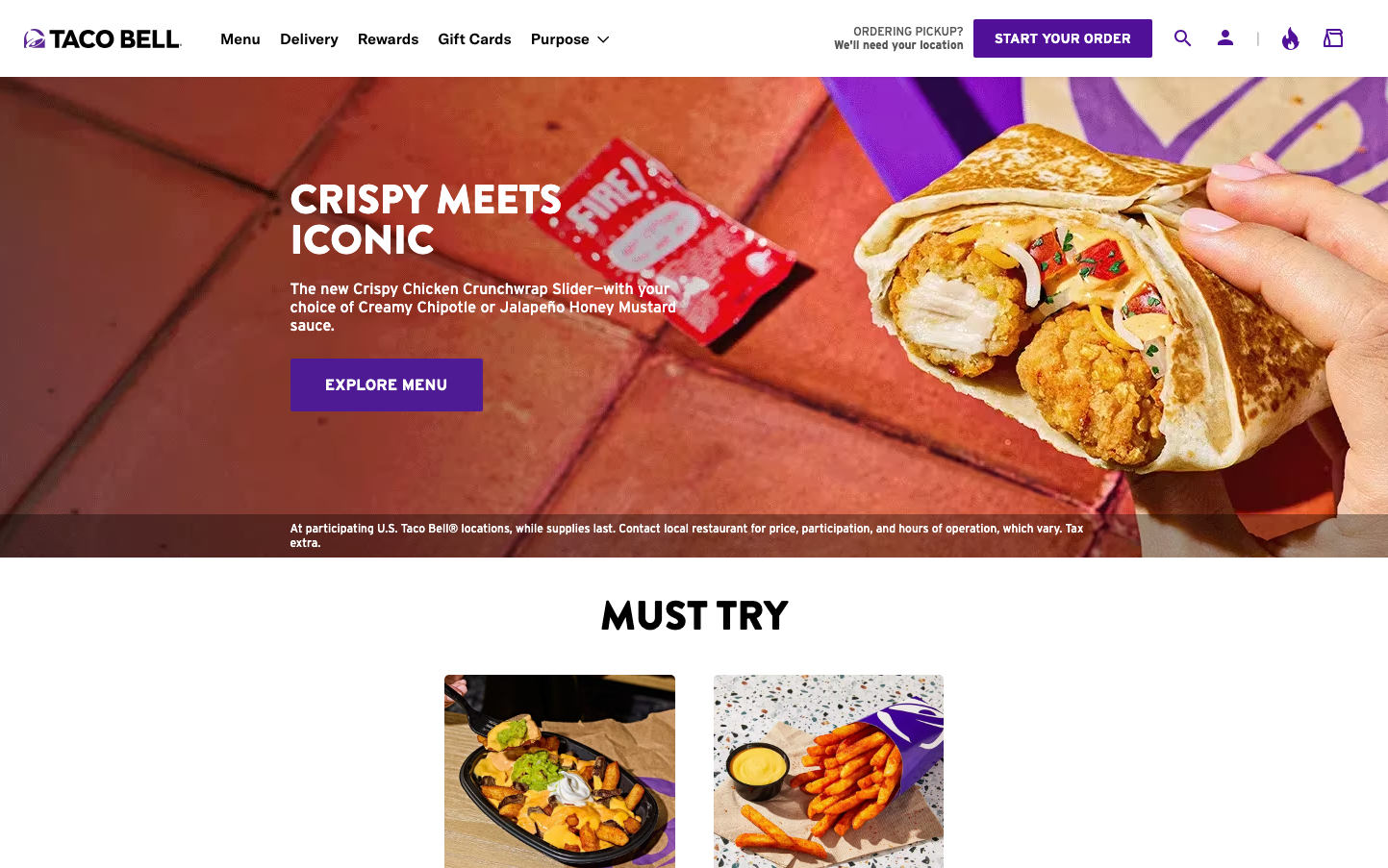
FoodTaco Bell's brand radiates unapologetic boldness through explosive purple and orange gradients that scream youth rebellion and late-night indulgence. The chunky Brandon Grotesque headlines combined with warm, crispy food photography creates an aesthetic that's simultaneously premium and playfully irreverent.
Design Identity
Signature Color
Rebellious Purple
#7B2CBF
youthful nonconformity and bold food experimentation that challenges traditional fast food expectations
Visual Identity
The diagonal split composition with saturated purple-to-orange gradient overlays on food photography - this theatrical lighting treatment makes every menu item look like it belongs in a music video rather than a typical fast food ad.
Component Style
Buttons feature bold rounded corners (approximately 8px radius) with high-contrast purple backgrounds and clean white text. The design emphasizes chunky, substantial feeling elements with strong shadows and vibrant fills rather than subtle borders or minimalist treatments.
Spacing Philosophy
Generous hero sections with dramatic full-bleed imagery create theatrical impact, while compact navigation and tight button spacing maintain efficiency for mobile-first ordering flows. The layout breathes with purpose rather than luxury.
Design Principles
- Headlines use Brandon Grotesque Black exclusively at 42px for maximum impact
- Purple gradients overlay all hero food photography for brand consistency
- Button text uses Interstate Bold for utilitarian clarity
- Corner radius stays consistent at 8px across interactive elements
- Body text never exceeds 16px to maintain mobile readability
Target Audience
Gen Z and millennial urban dwellers who view fast food as a lifestyle choice rather than necessity - people who want their late-night cravings to feel like cultural rebellion
Mood
Design descriptions are AI-generated based on visual analysis and may not fully reflect the brand's official design guidelines.
Design System
Typography Scale
| Element | Font | Size | Weight | Line Height |
|---|---|---|---|---|
| body | 14px | 400 | normal | |
| h1 | 42px | 400 | 42px | |
| h2 | 42px | 400 | 42px | |
| h3 | 24px | 400 | 24px | |
| h5 | 16px | 400 | normal | |
| h6 | 14px | 400 | normal | |
| p | 16px | 400 | 19.2px | |
| a | 14px | 400 | normal | |
| button | 24px | 400 | normal | |
| nav | 24px | 400 | normal |
Color Palette
No colors extracted


